Saatchi & Saatchi X + Wendy’s
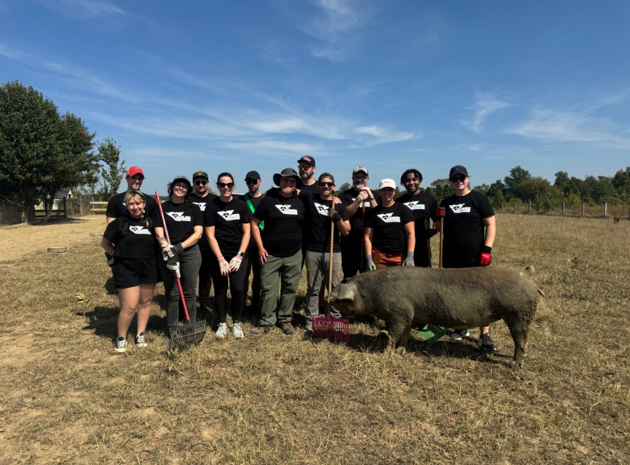
Art Director of National New Product Campaigns at Wendy’s sitting in house with the client. Concepting, designing, and developing 360 campaigns to advertise new products and deals across digital, print, and point of purchase. Executing campaigns from sketch to execution and being hands in every step in-between.

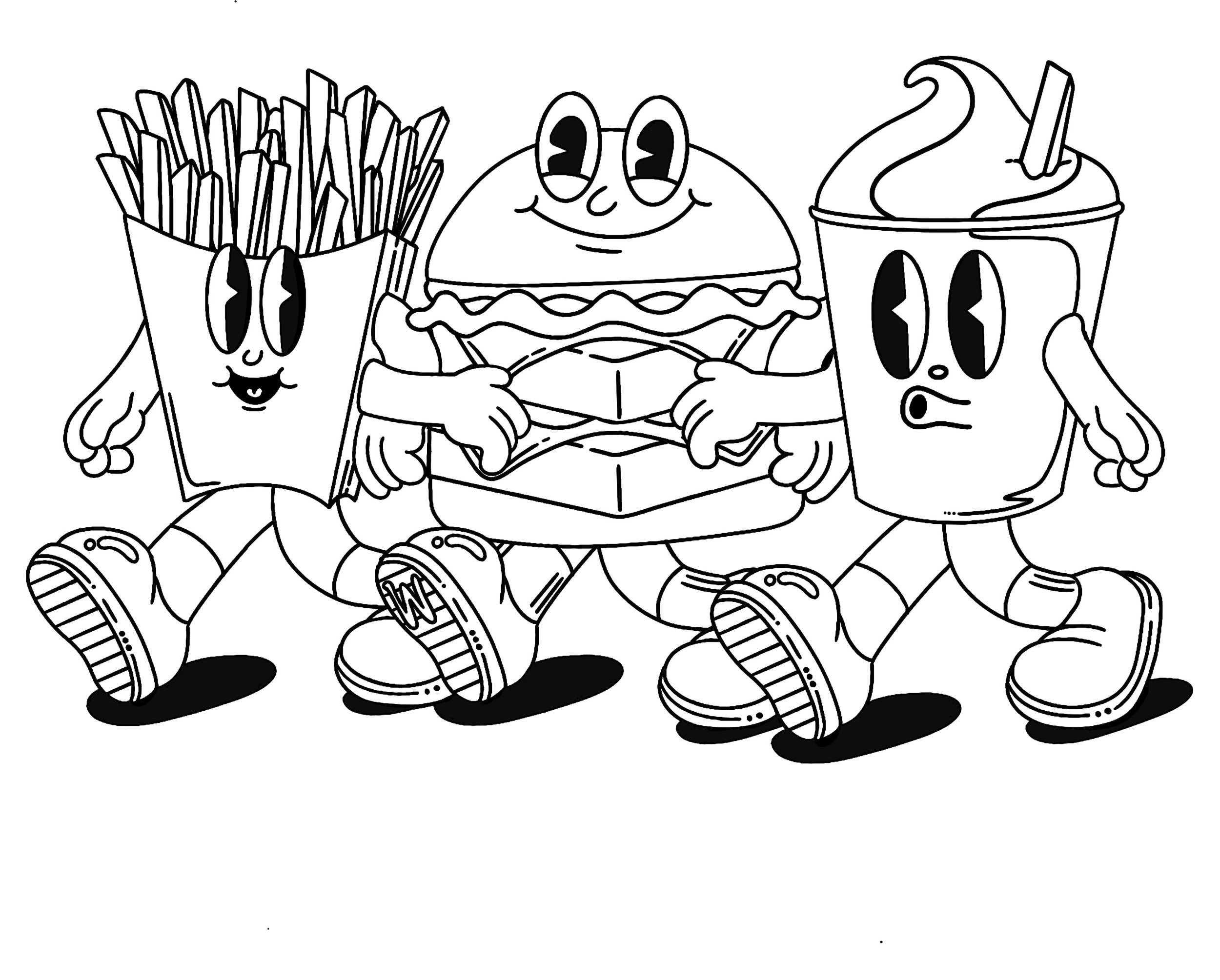
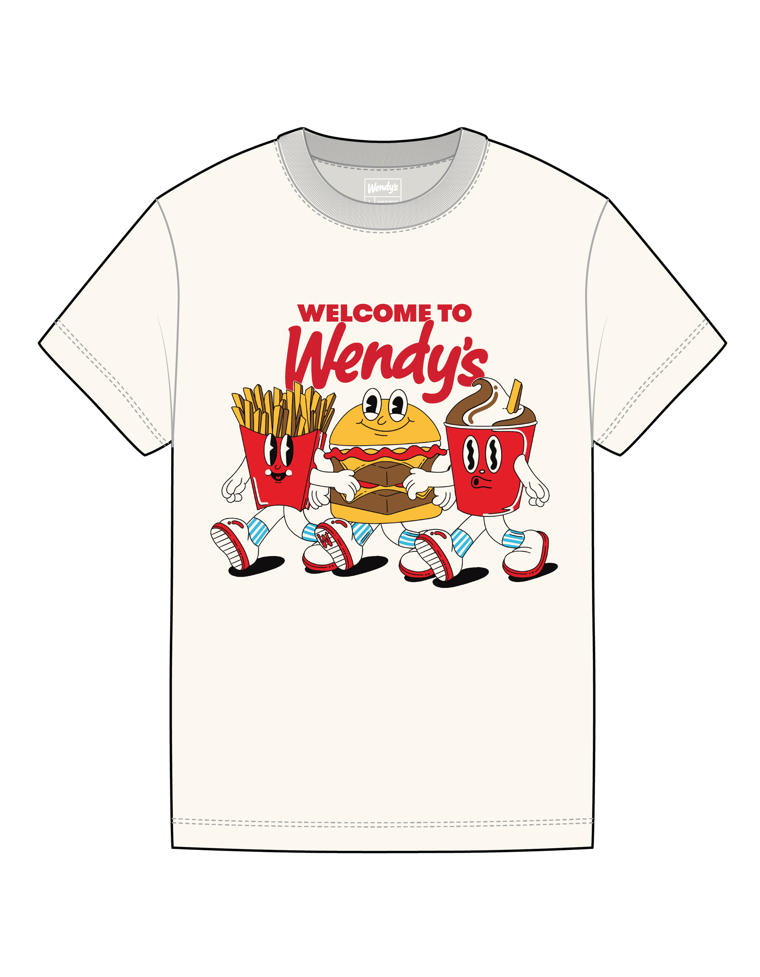
Wendy’s has an internal employee merchandise store that refreshes new products every season. This is a shirt illustration I’ve done for new employees to receive during their first trip to the global home office as a welcome gift.
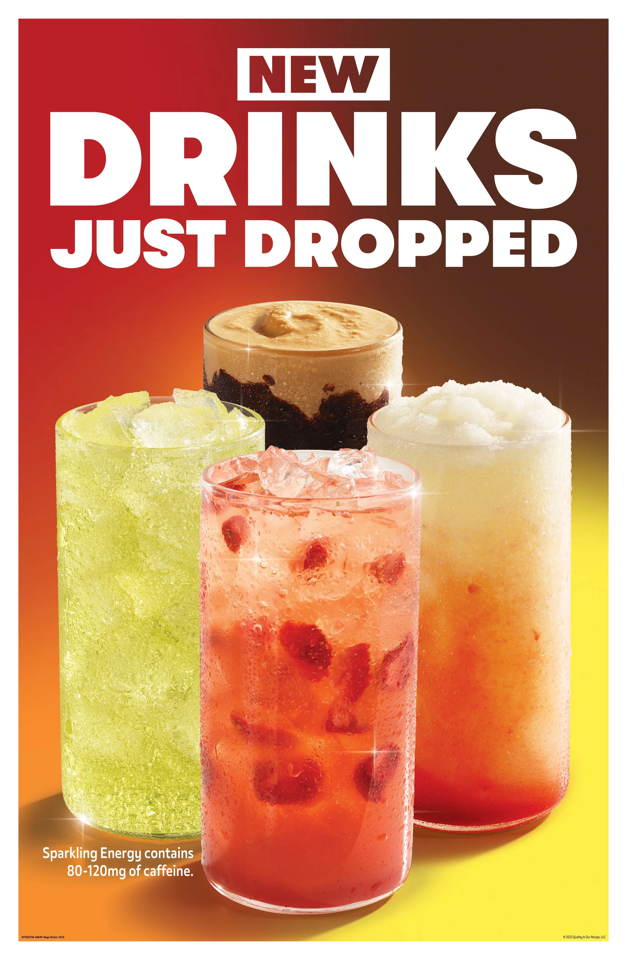
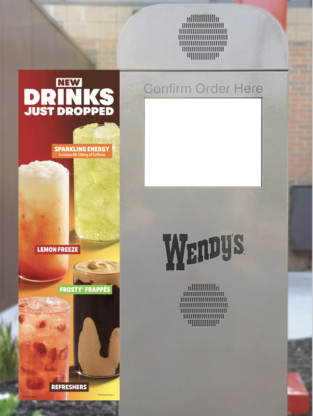
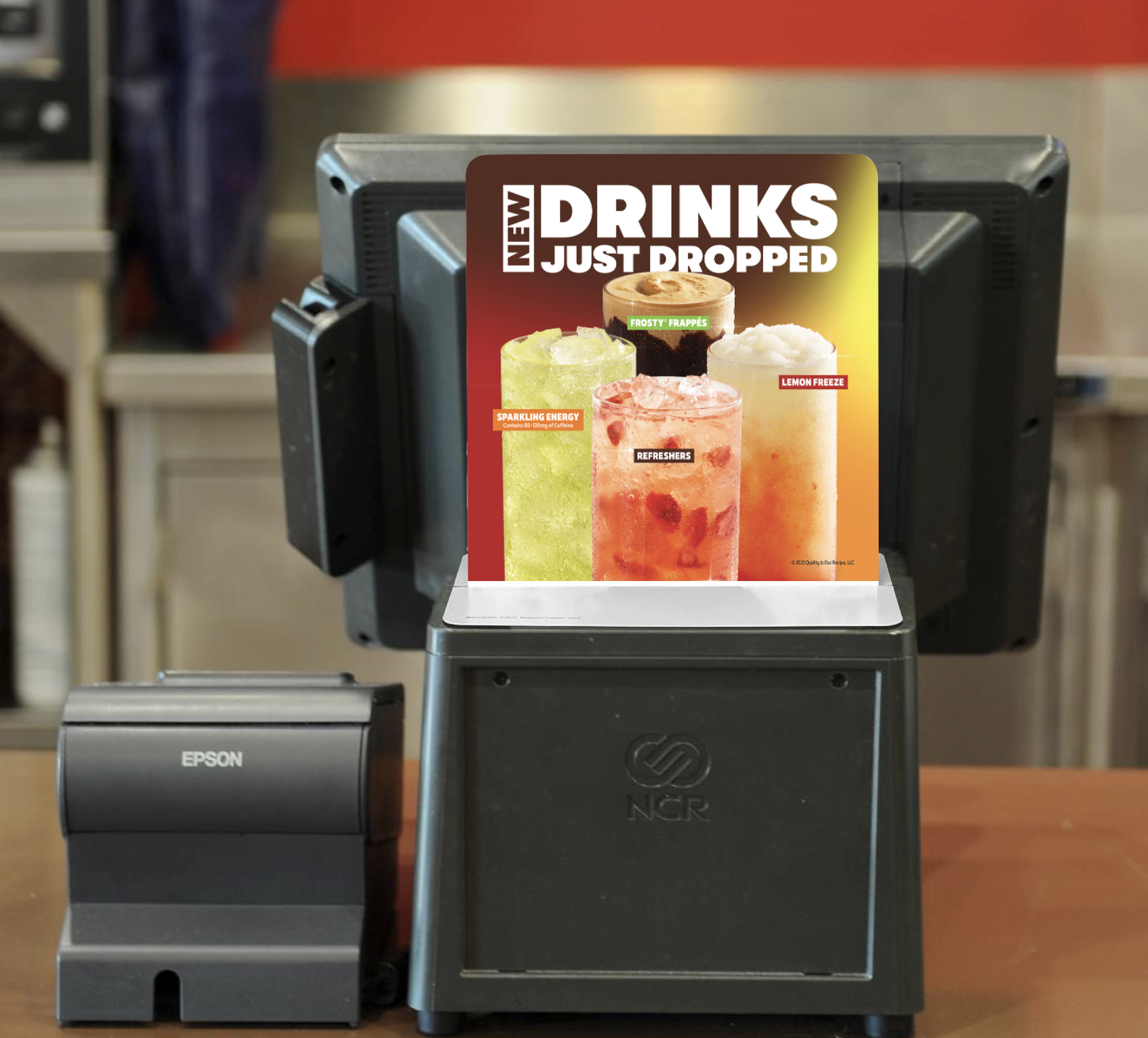
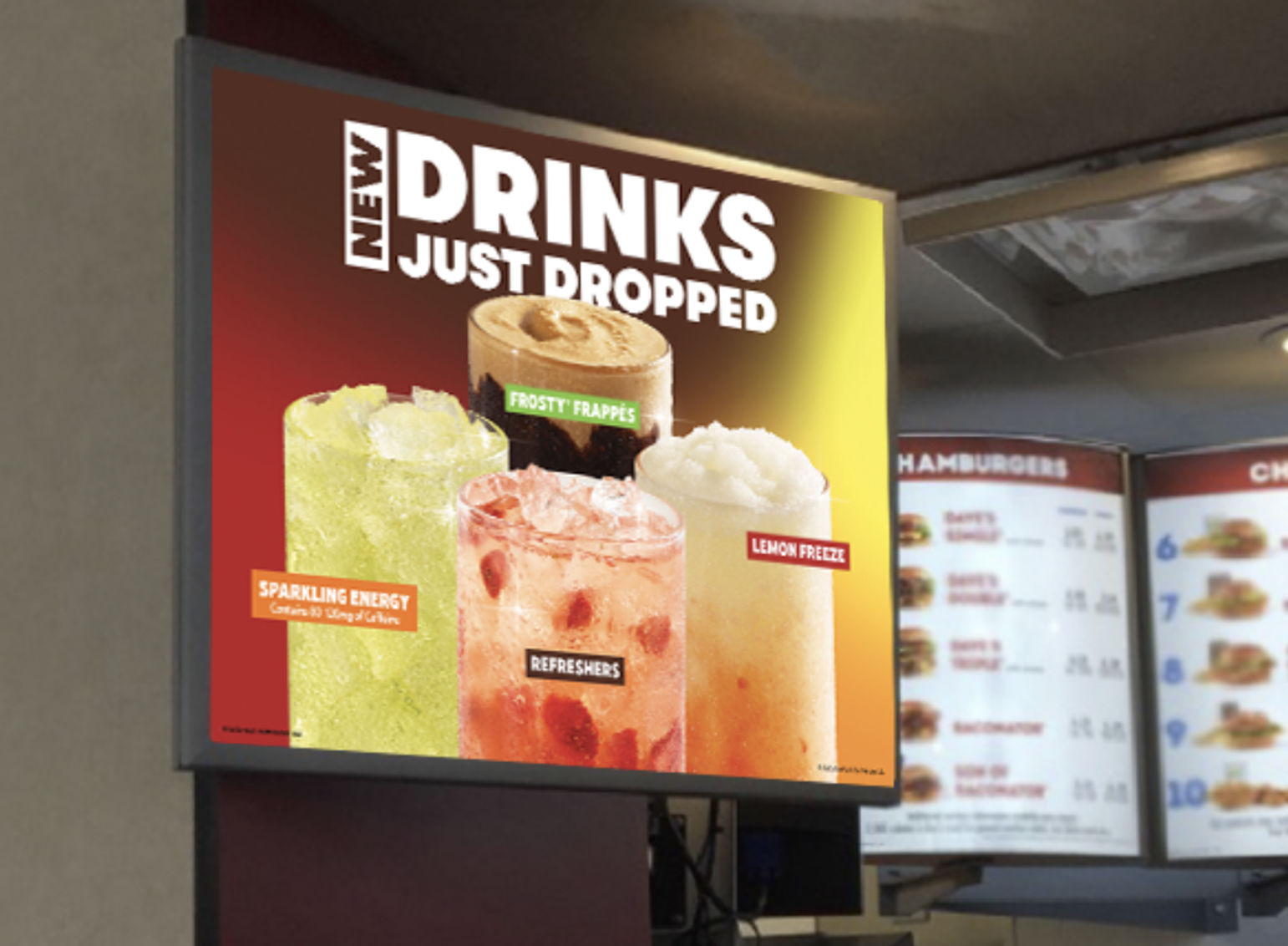
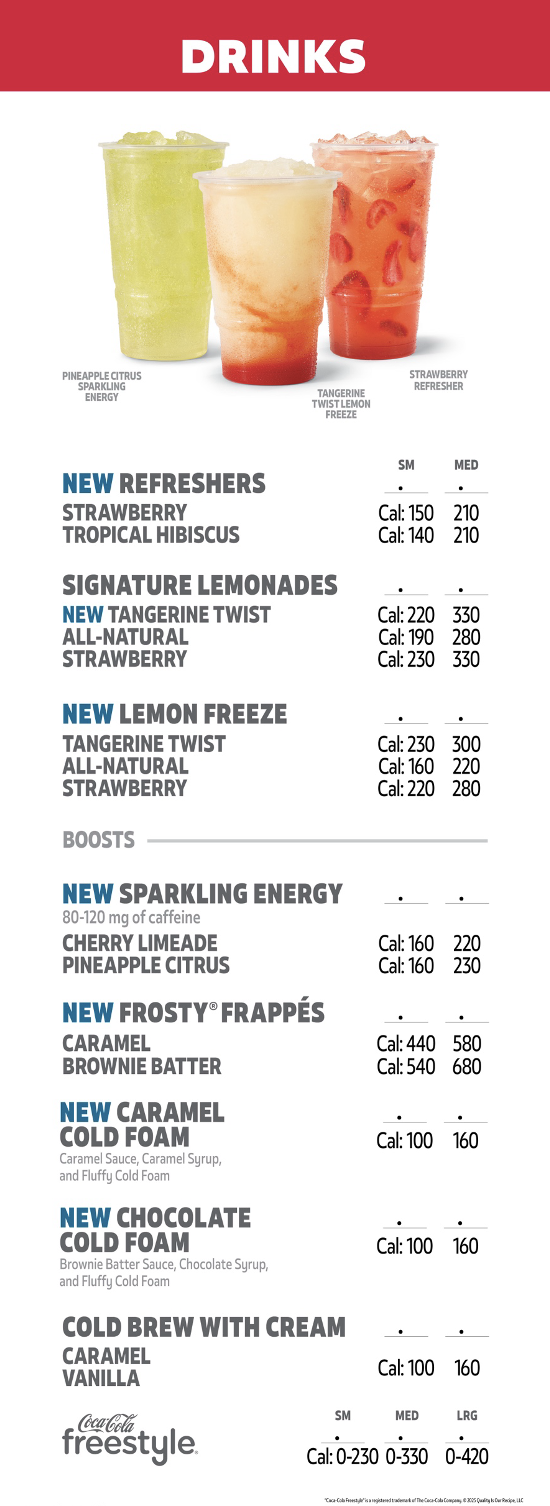
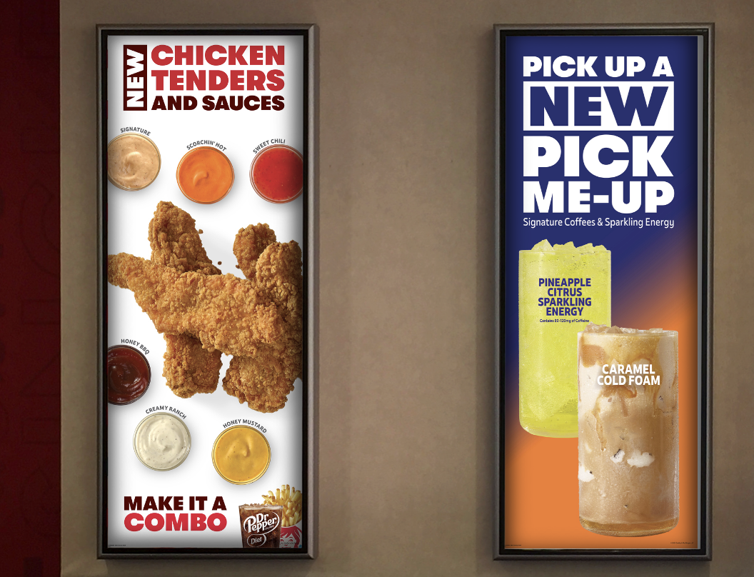
Developing a creative solution to showcase multiple brand new categories of drinks in one creative by celebrating their differences with a quad gradient of their contrasting colors - highlighting each differing drink to marry them in a collective collaboration of them all. Placing them in a bowling pin like formation to exhibit their details with adding sparkles for aesthetics but also they are new and shiny. Campaign went across print and digital ranging from small pixel web ads and social media, to billboards and front of store advertising.
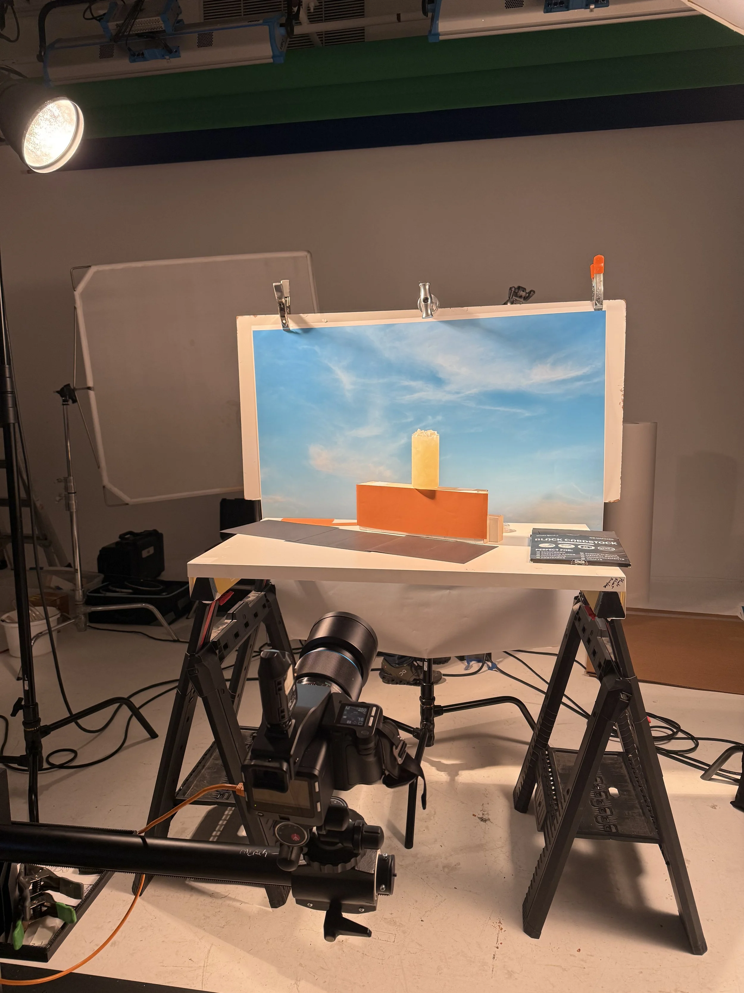
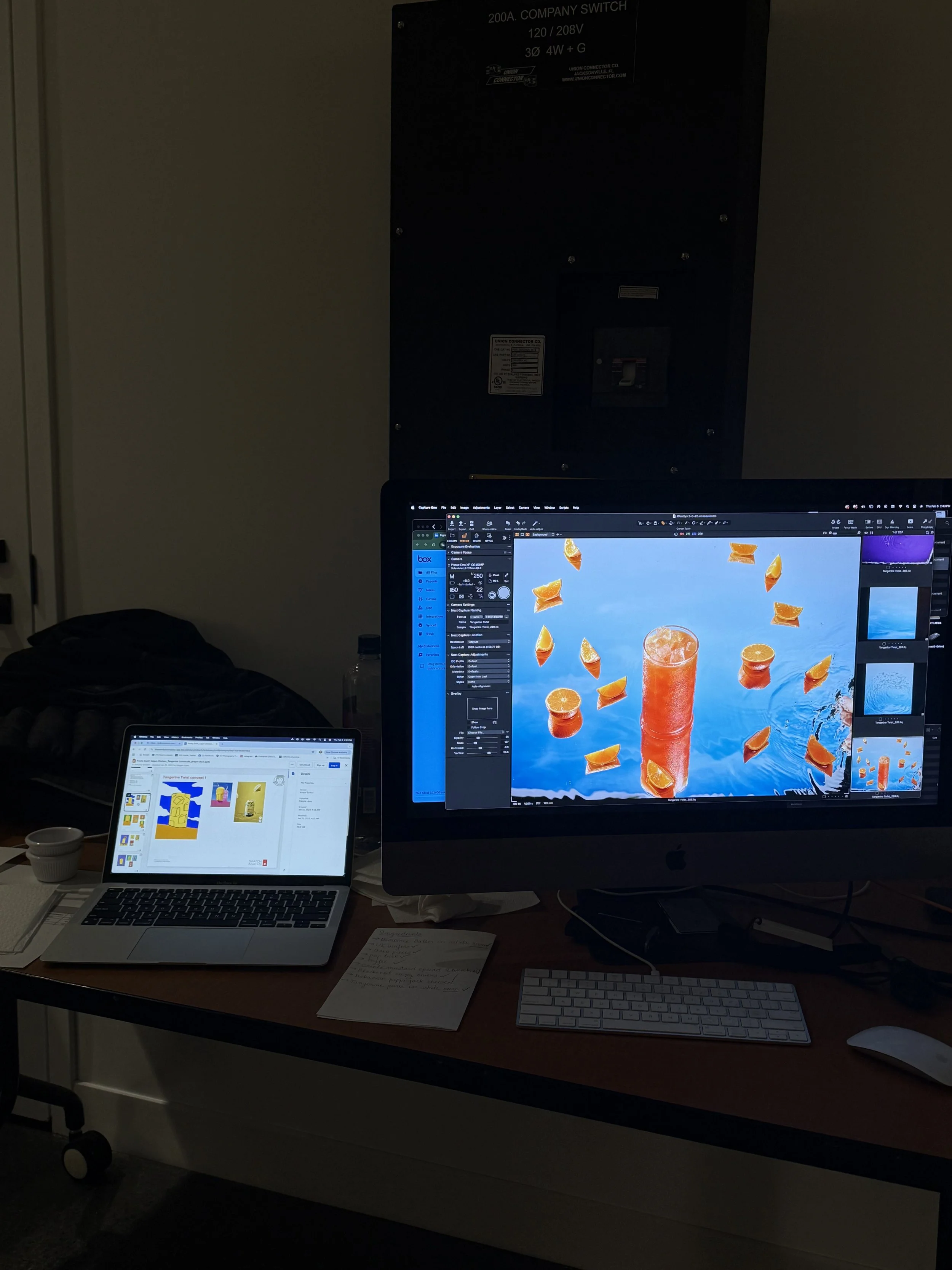
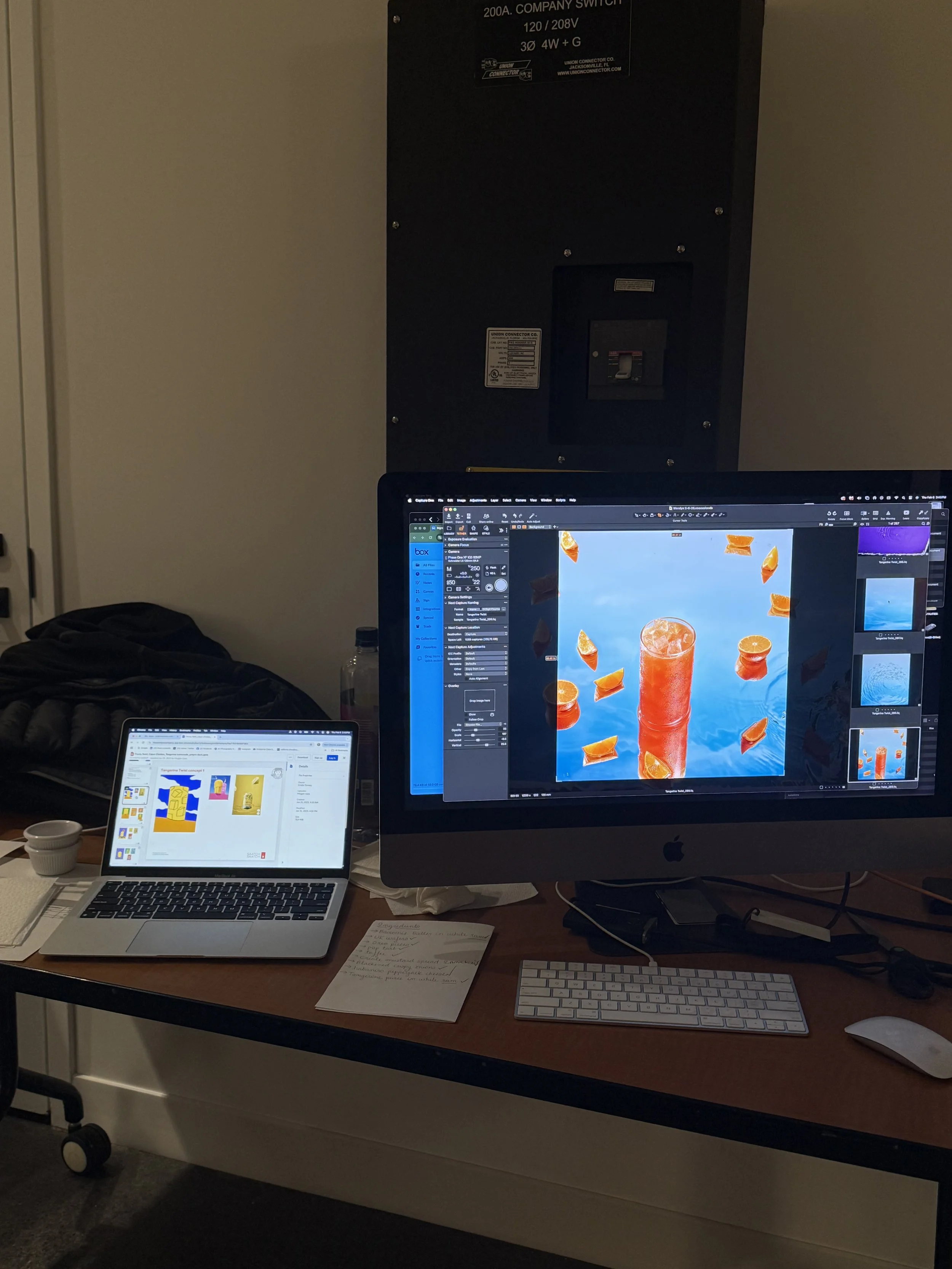
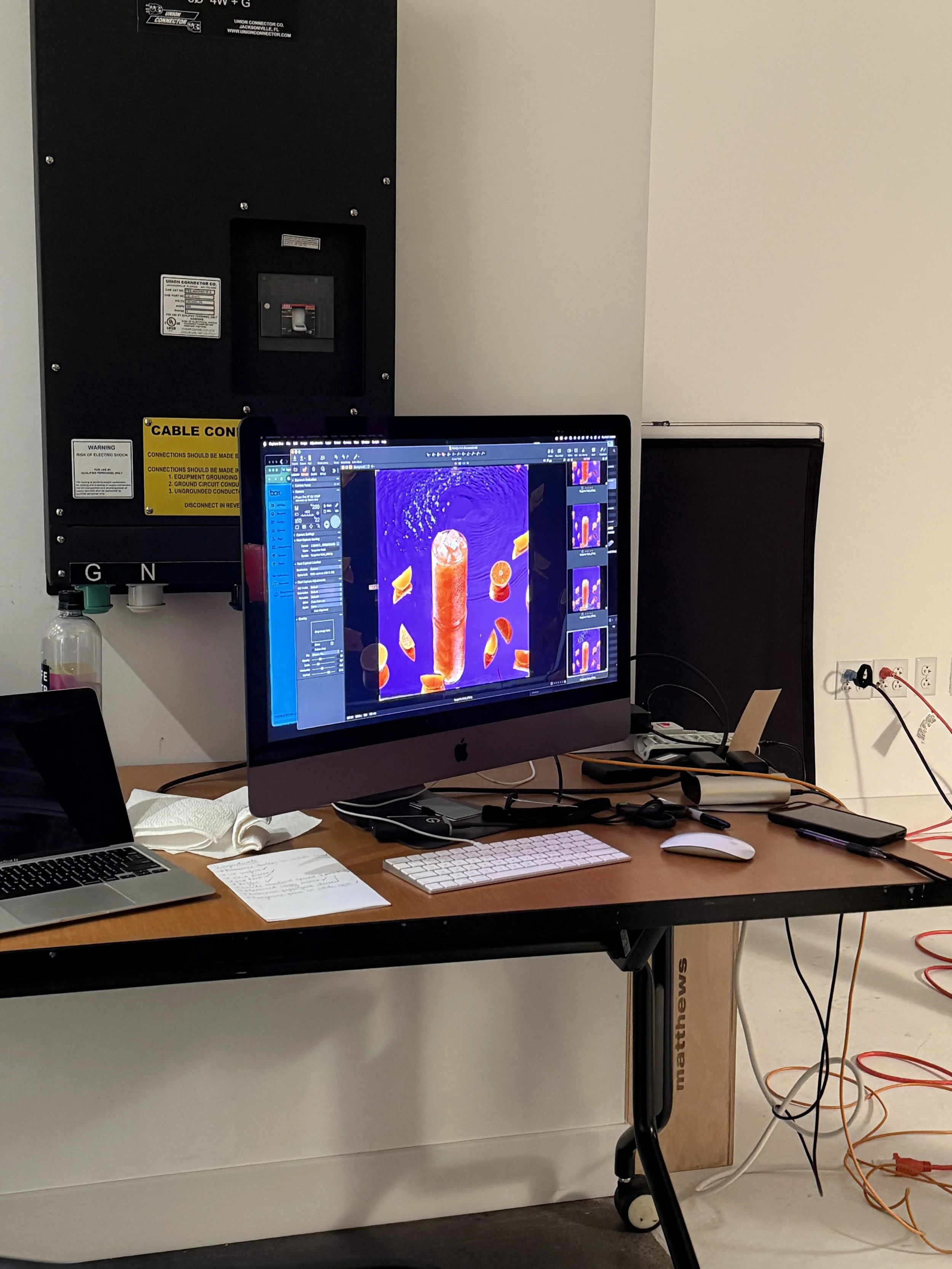
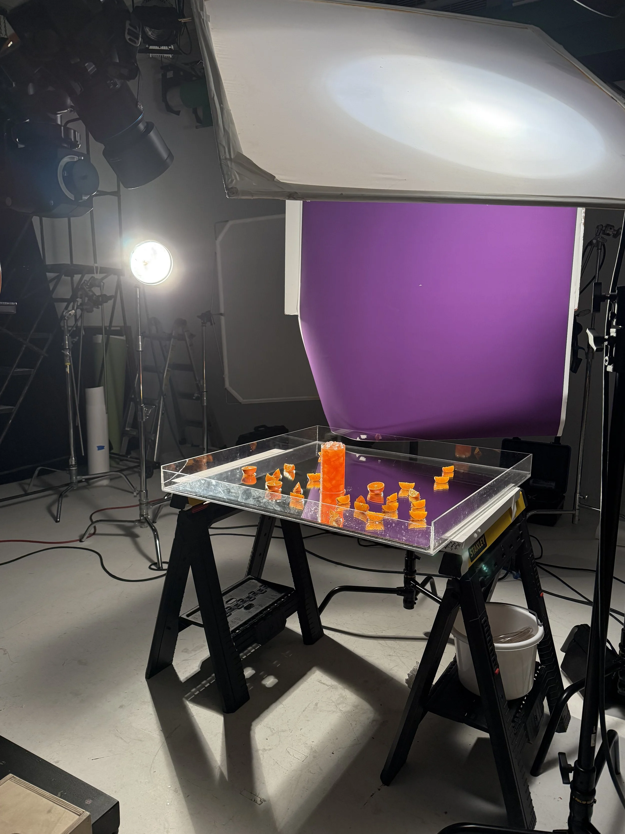
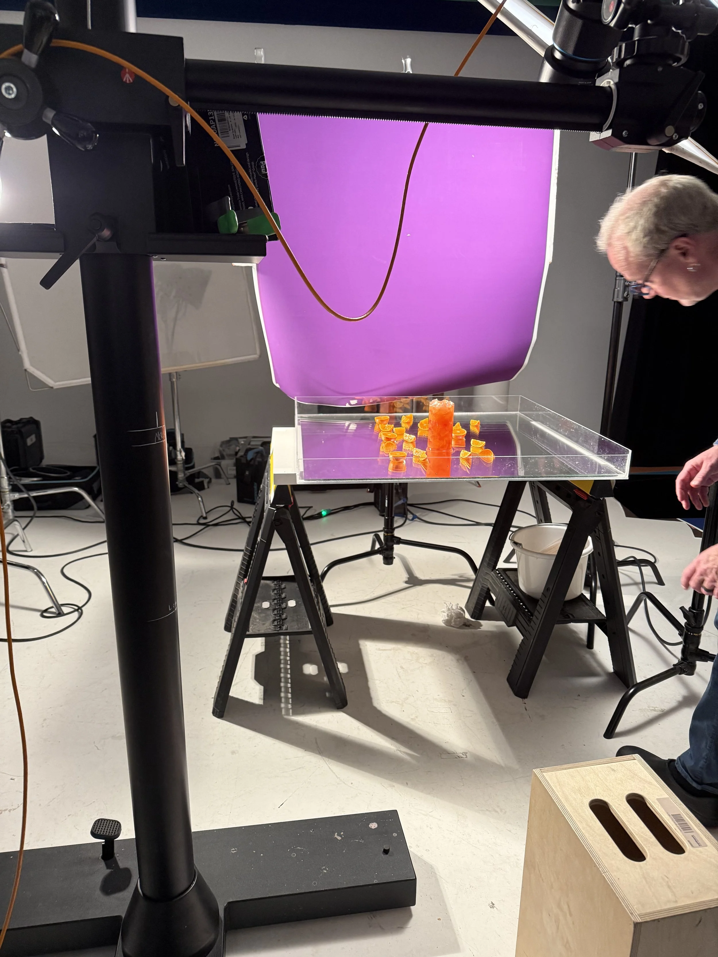
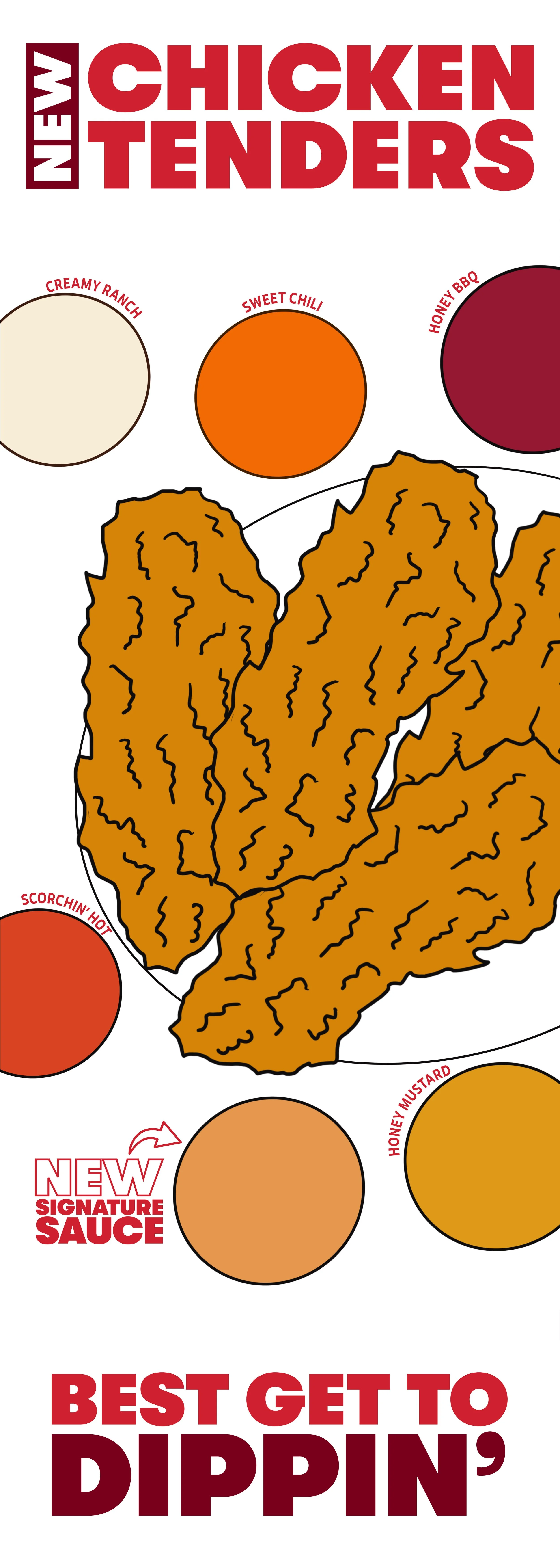
The photos provided show the process of the campaign taken from sketch to the photo studio to print and digital.
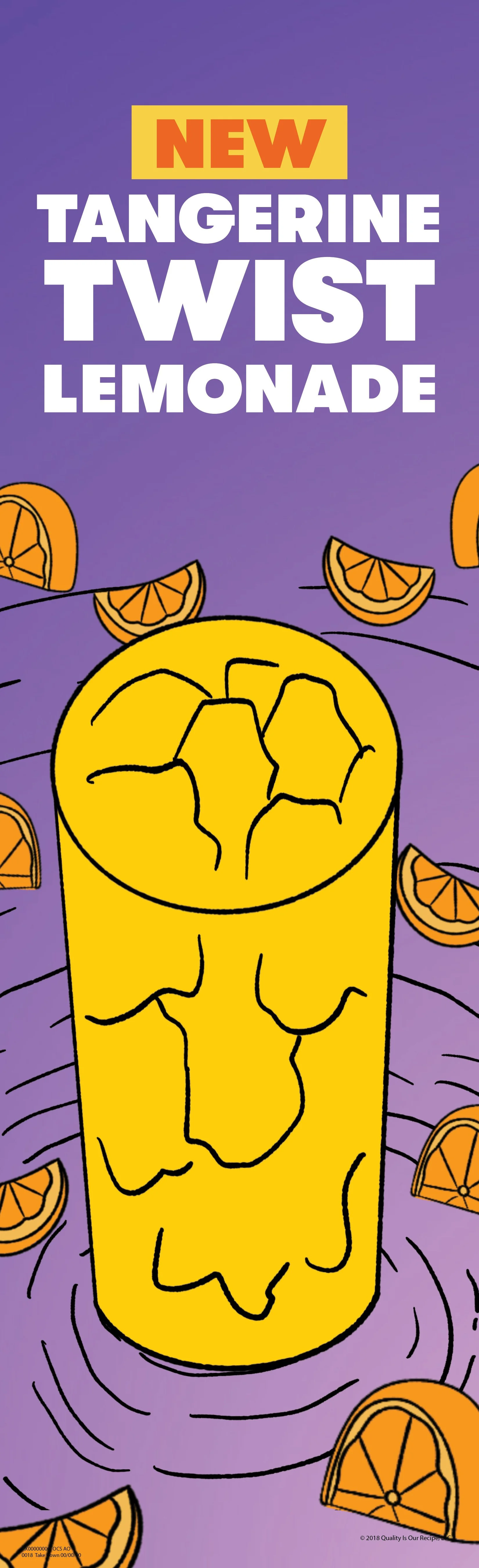
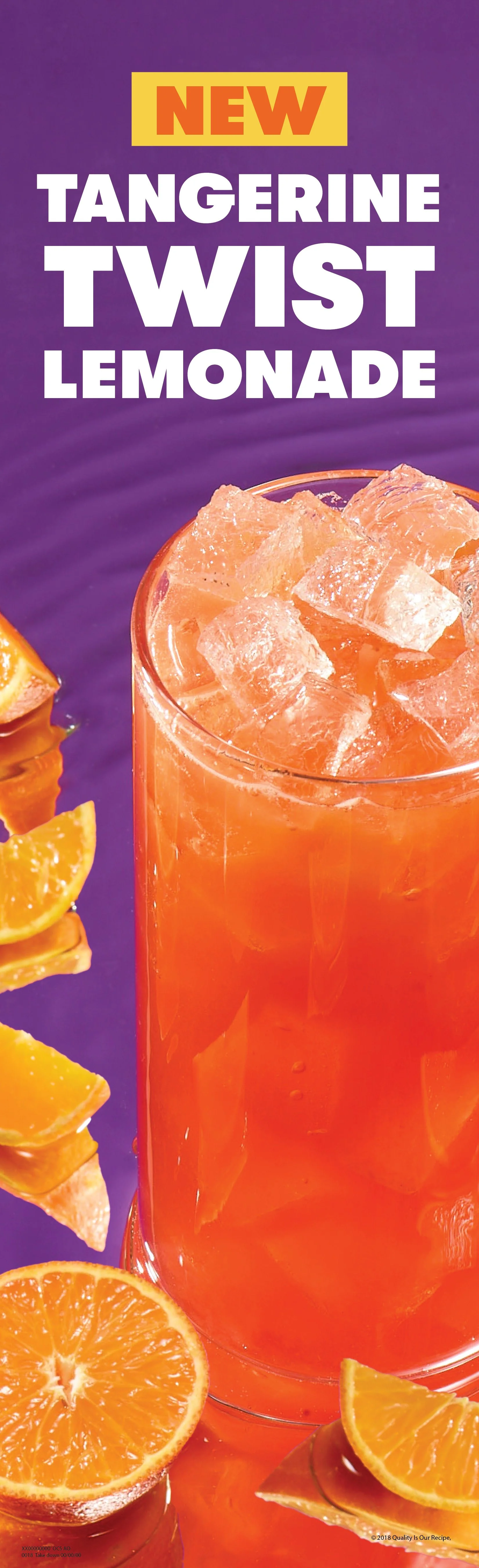
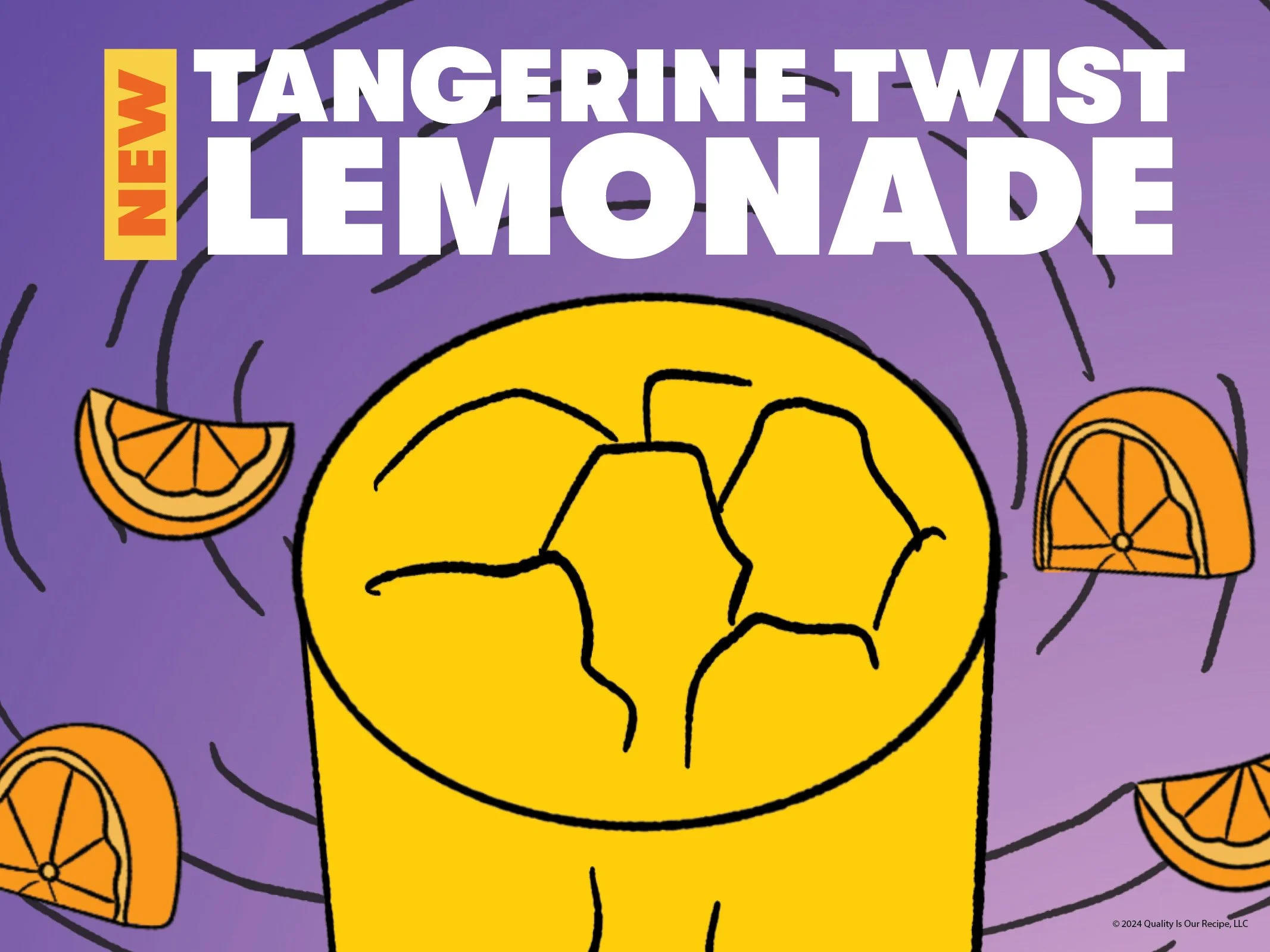
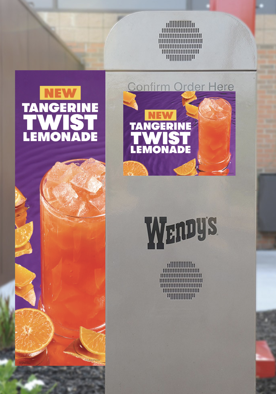
New Drinks Campaign
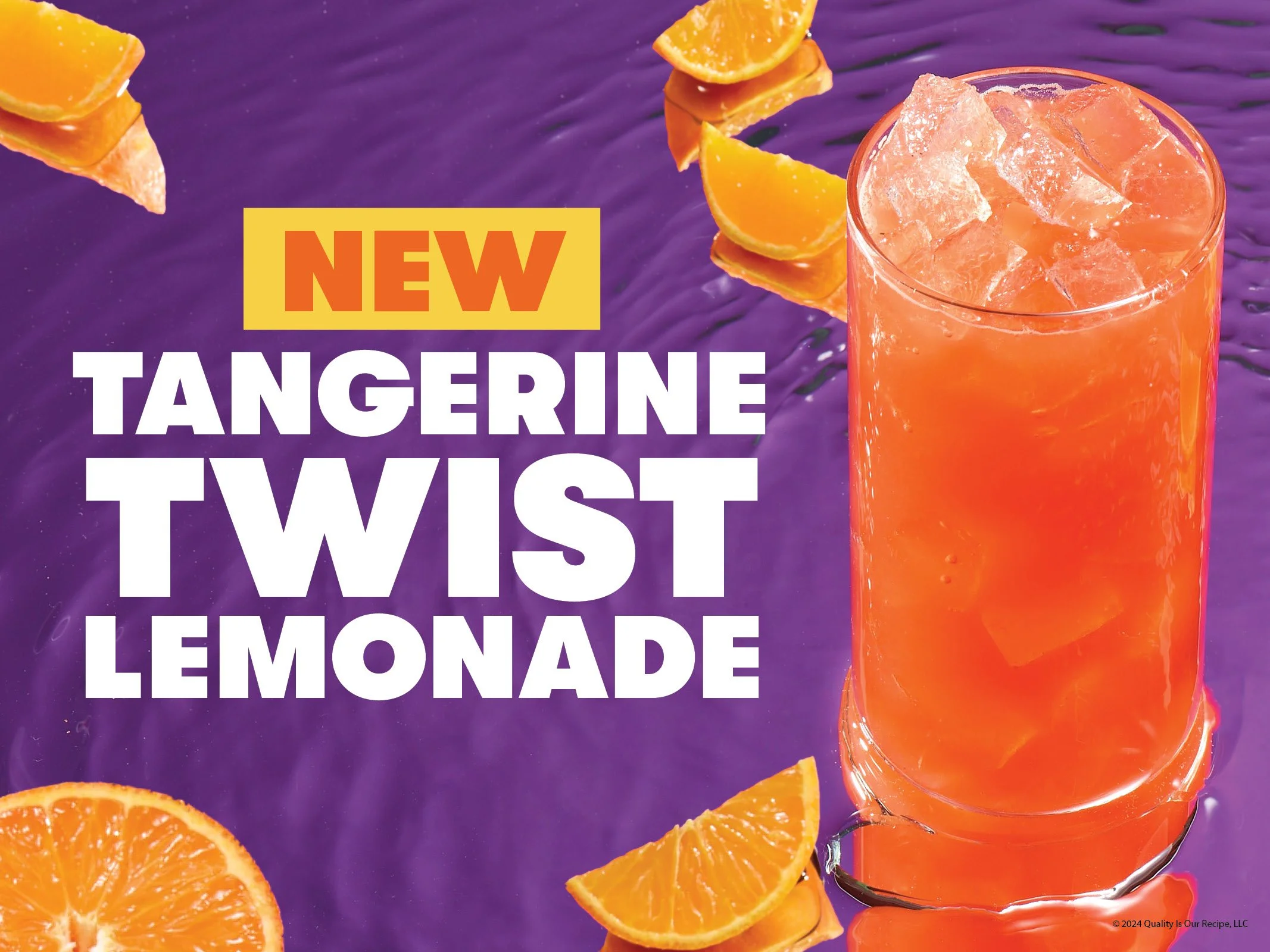
Contrasting the color of Tangerine Twist to a purple background reflected on top of a mirror with water and tangerine slices! This drink dropped in the summer so playing on a summer action, pool party, while also showcasing how fresh and refreshing this drink is. Below you can see my sketches compared to the final product for print. I ultimately had to move some things around in post to get the best creative.
The photos provided show the process of the campaign taken from sketch to the photo studio to print and digital.
Tangerine Twist Lemonade

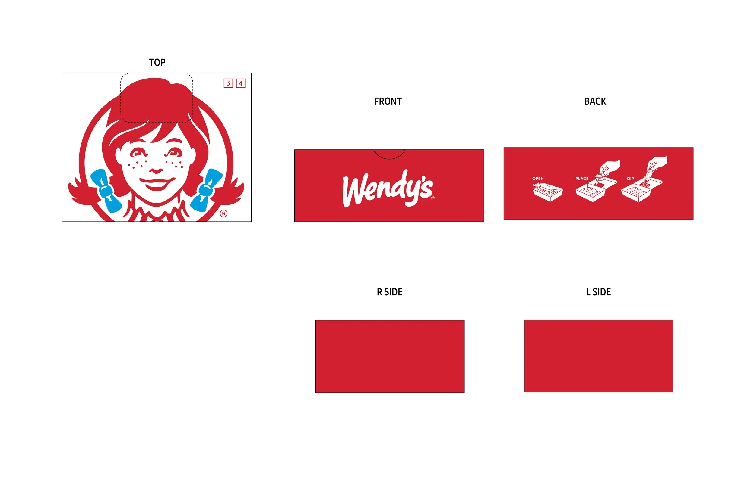
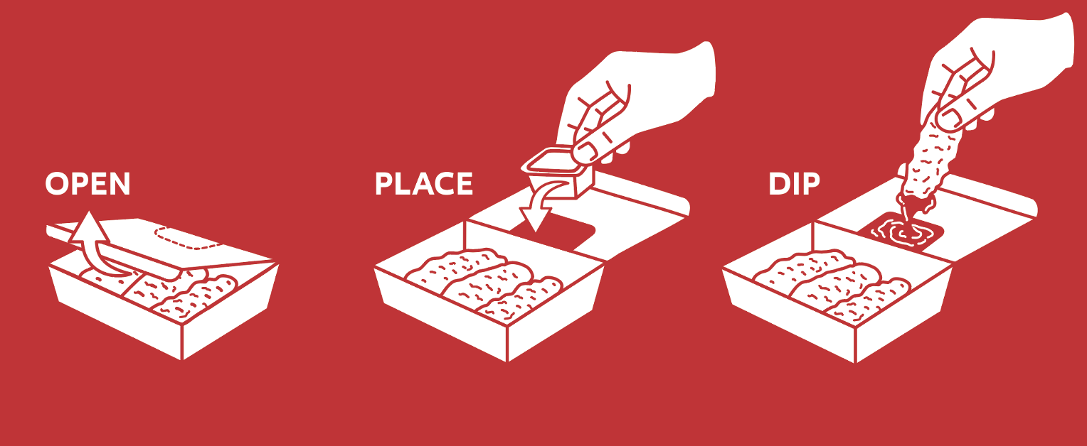
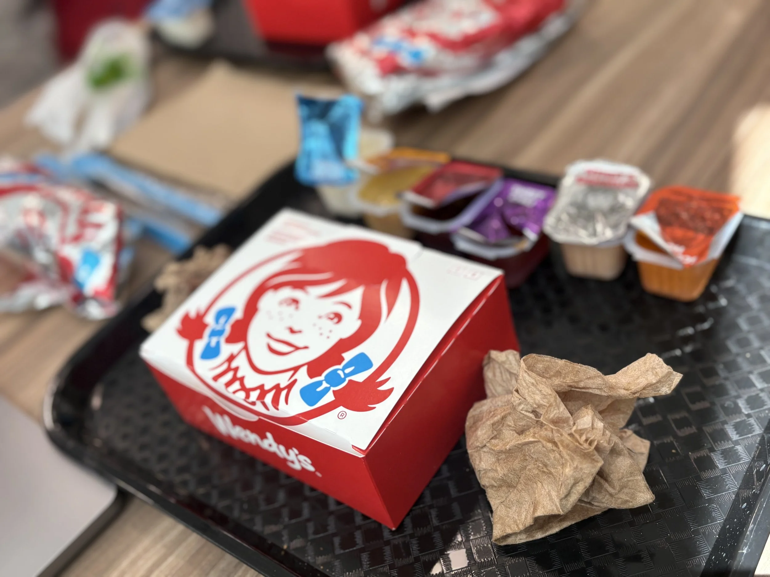
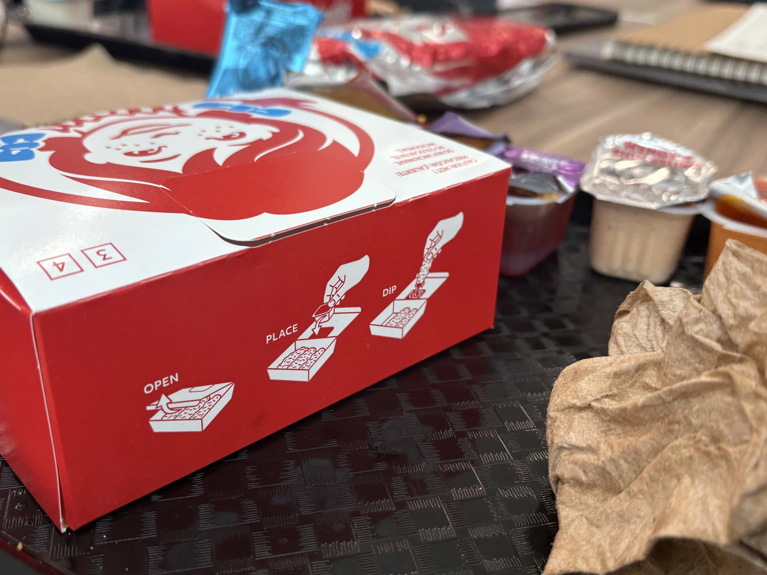
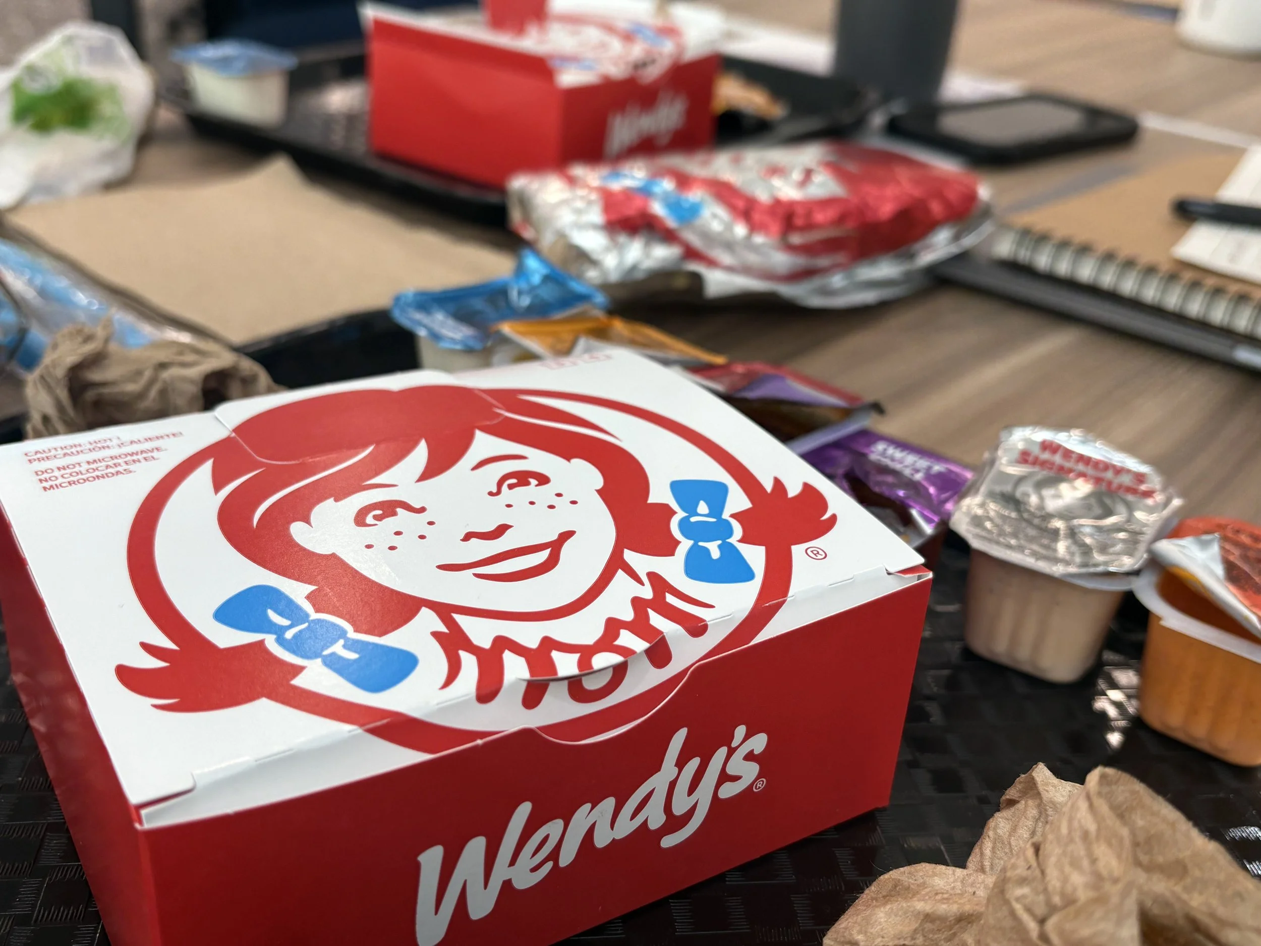
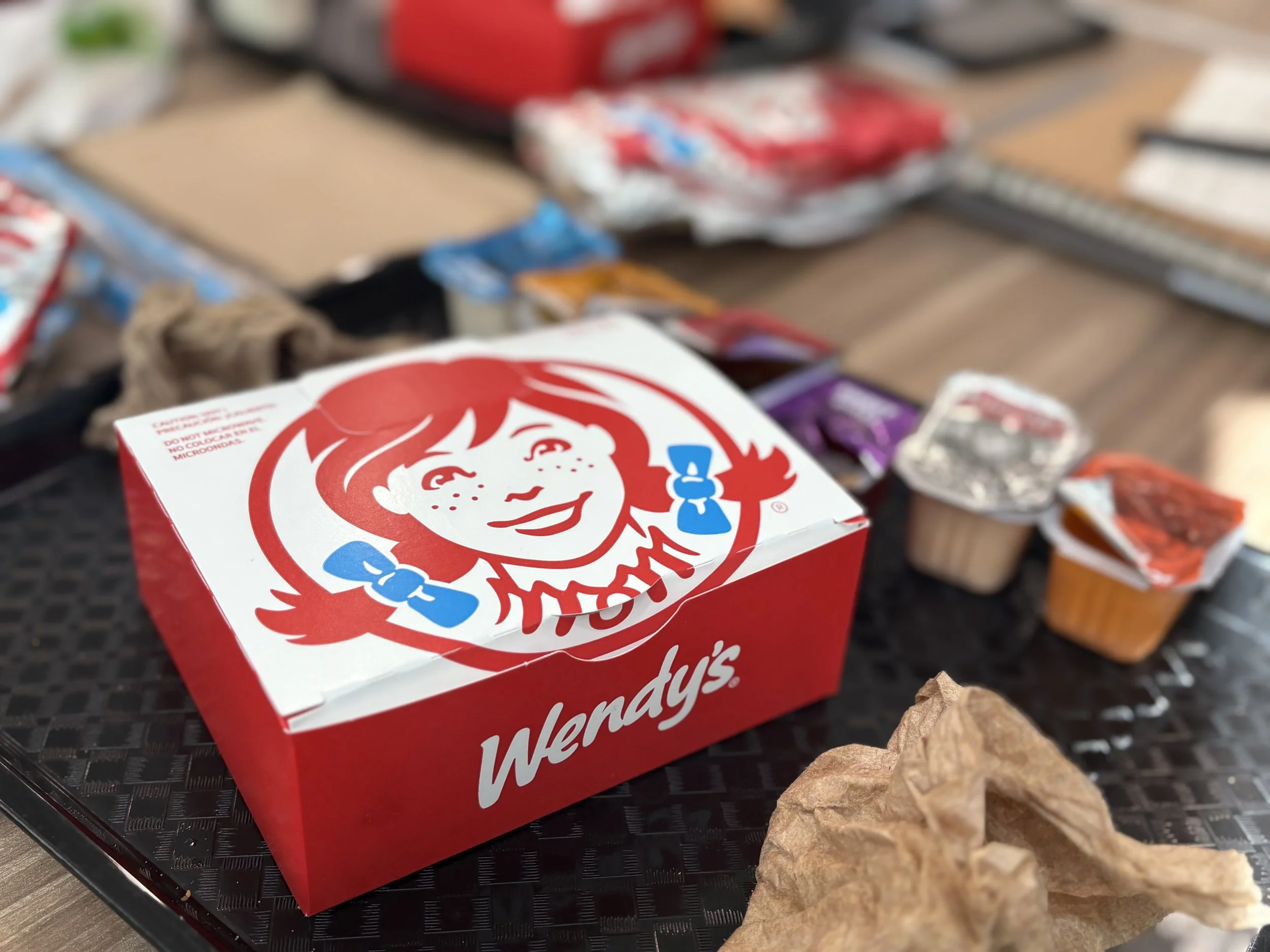
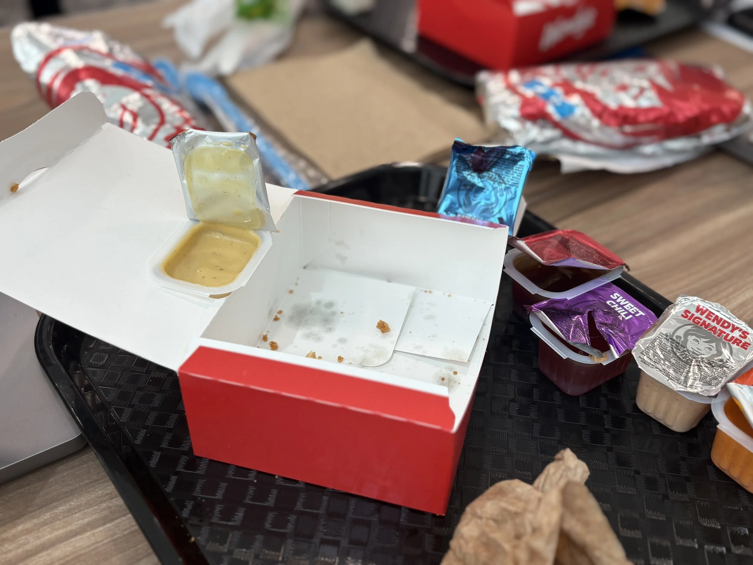
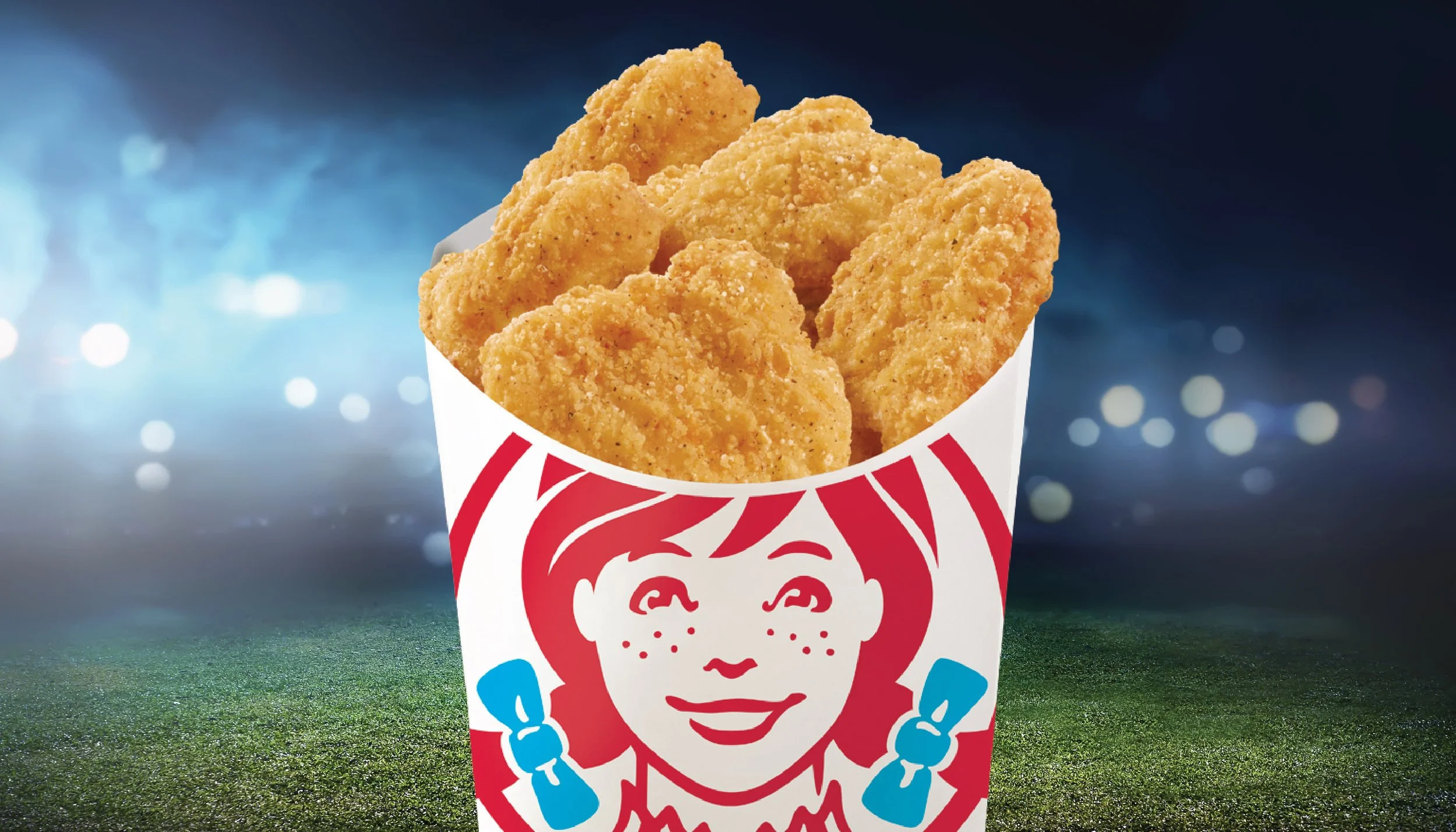
Designed packaging for Wendy’s new chicken tenders, keeping the look simple and consistent with brand colors and imagery. Incorporated a built-in sauce slot for convenience and created step-by-step illustrations on the back panel to guide customers on how to use it.
Tender Carton Packaging + Illustration
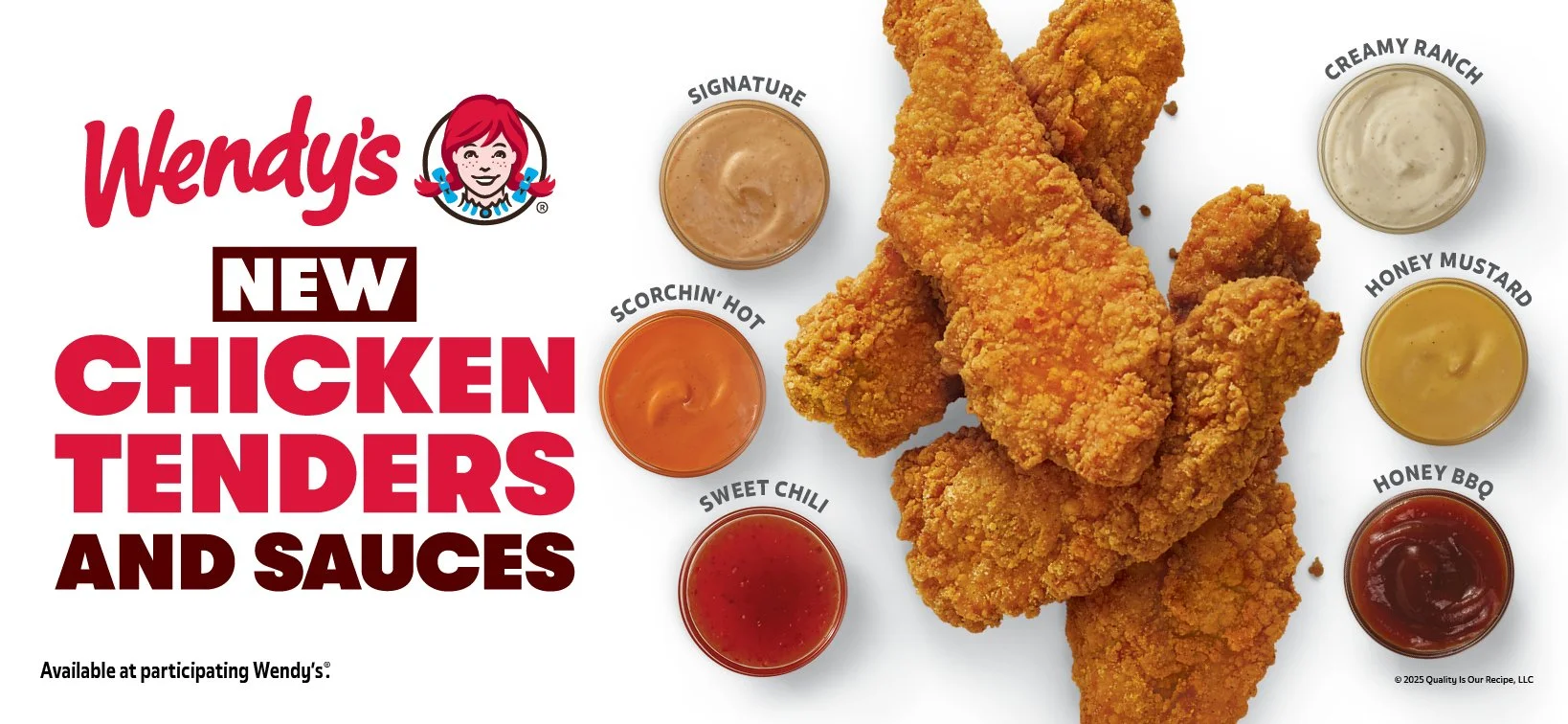
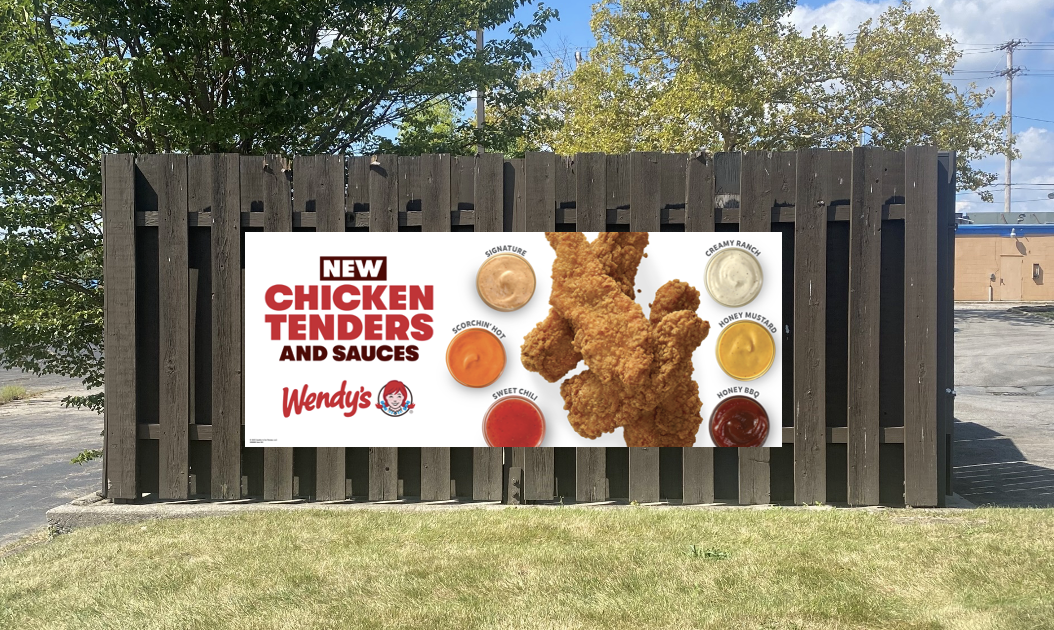
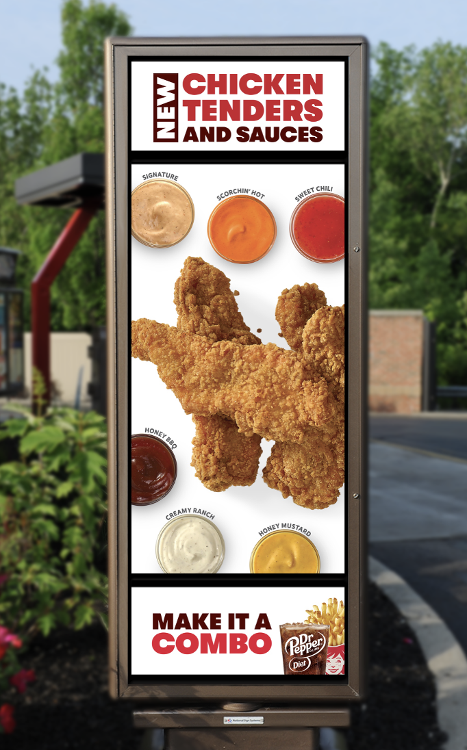
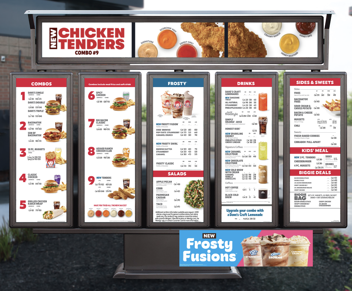
To launch tenders, we were inspired by their sheer size and decided to go big. Overhead shots show their scale while also highlighting their crispy texture. The white background allows the chicken to pop and the new sauces provide colorful accents.
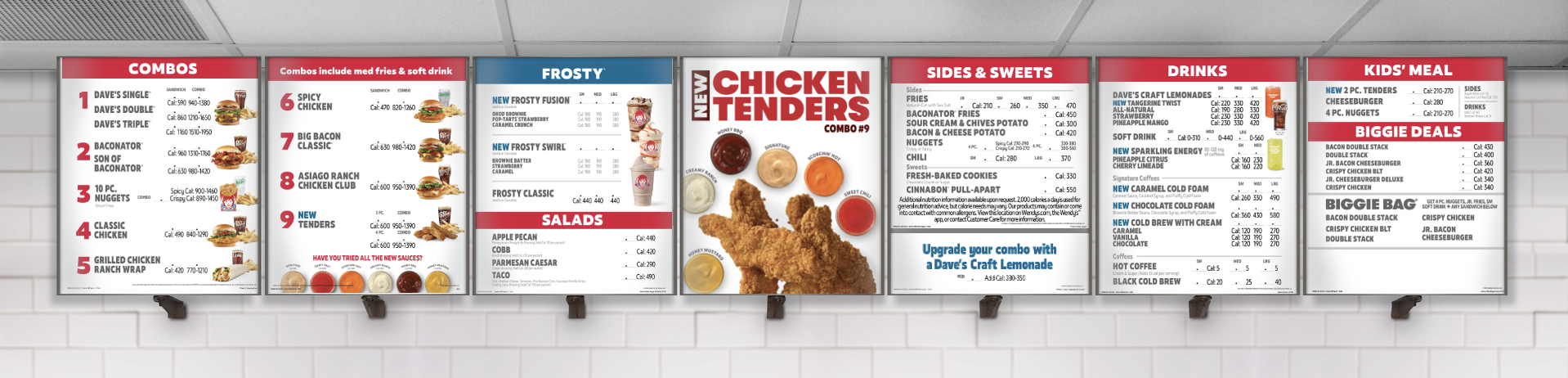
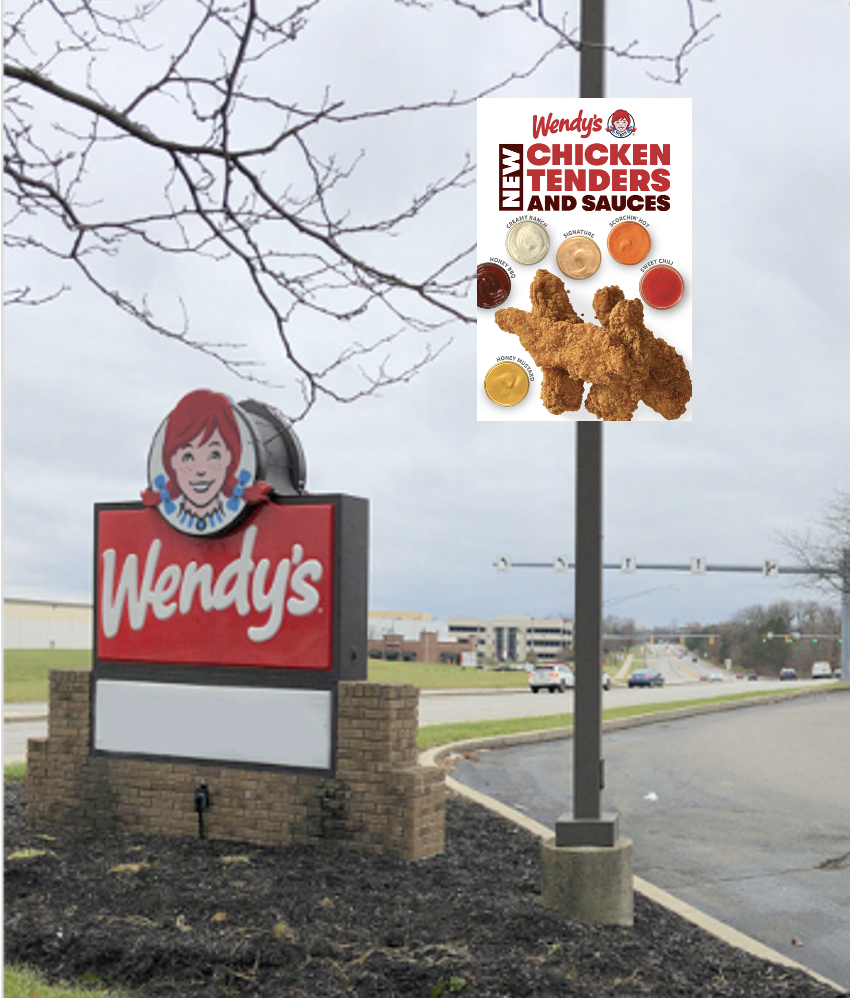
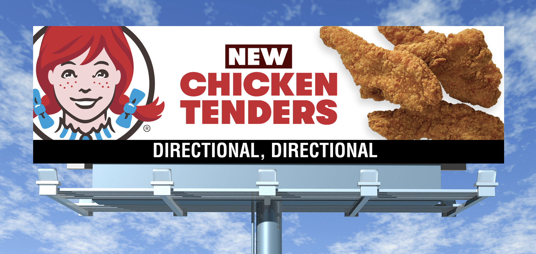
Chicken Tenders Campaign


Window Paintings
The beginning of a retro window painting evergreen campaign to advertise deals and new store schedules. Working with local sign painters to come into restaurants and use these as a guide for final results - Pantone colored paints are supplied.

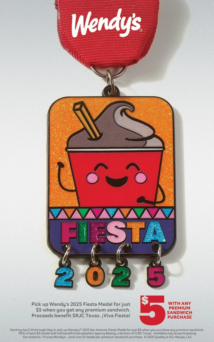
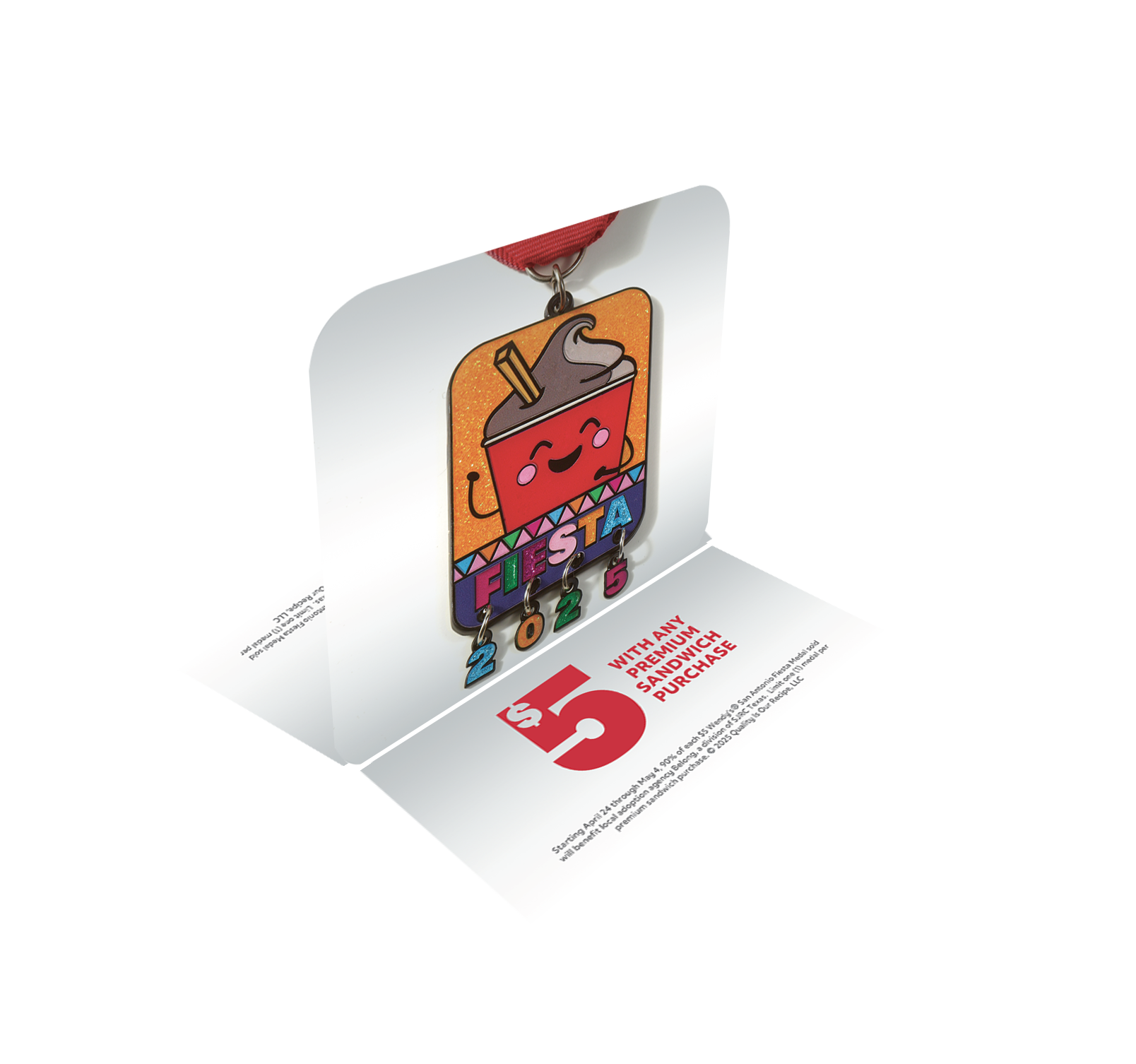
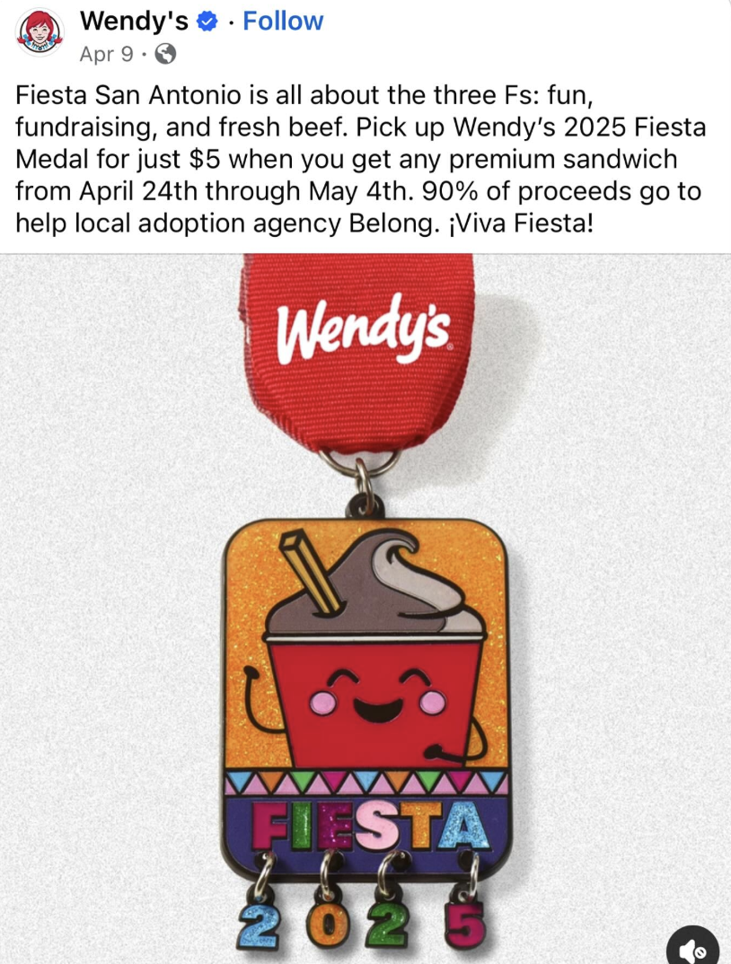
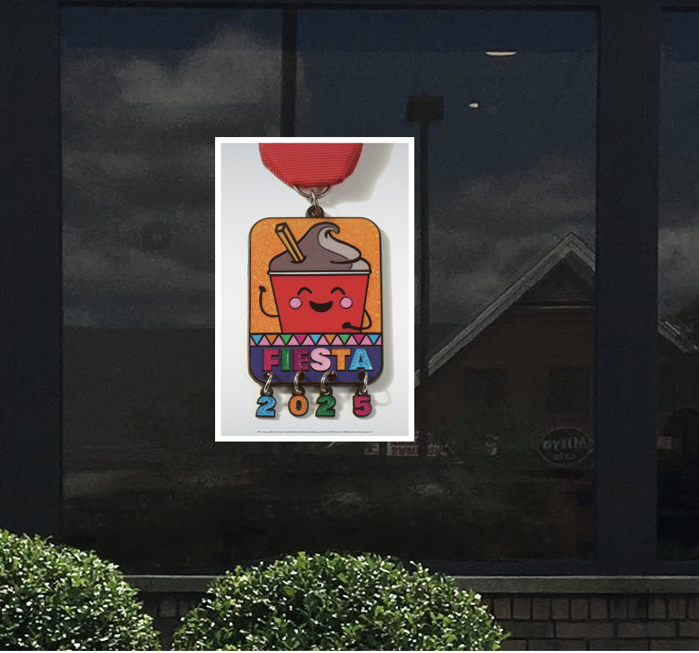
San Antonio Fiesta Medal 2025
Bringing Wendy’s to the San Antonio Fiesta with a medal to pass out with bright colors, our mascot Nurdle, and glitter to celebrate! From the development of the medal to execution across print and digital platforms.


DoorDash/ UberEats Imagery
Creating imagery to stand out to potential customers in a sea of other brands fighting for the same results is a constant research of keeping up with other brands and what they are doing. Wanting to keep imagery true to the campaign storytelling but adding in elements to make them stand out in different settings.
Coupon Mailers
Coupon mailers are front and back, separating the coupons from the top and bottom sections giving customers a full page of opportunities. Designing our offerings to match back to their original campaign design to keep the storytelling going.
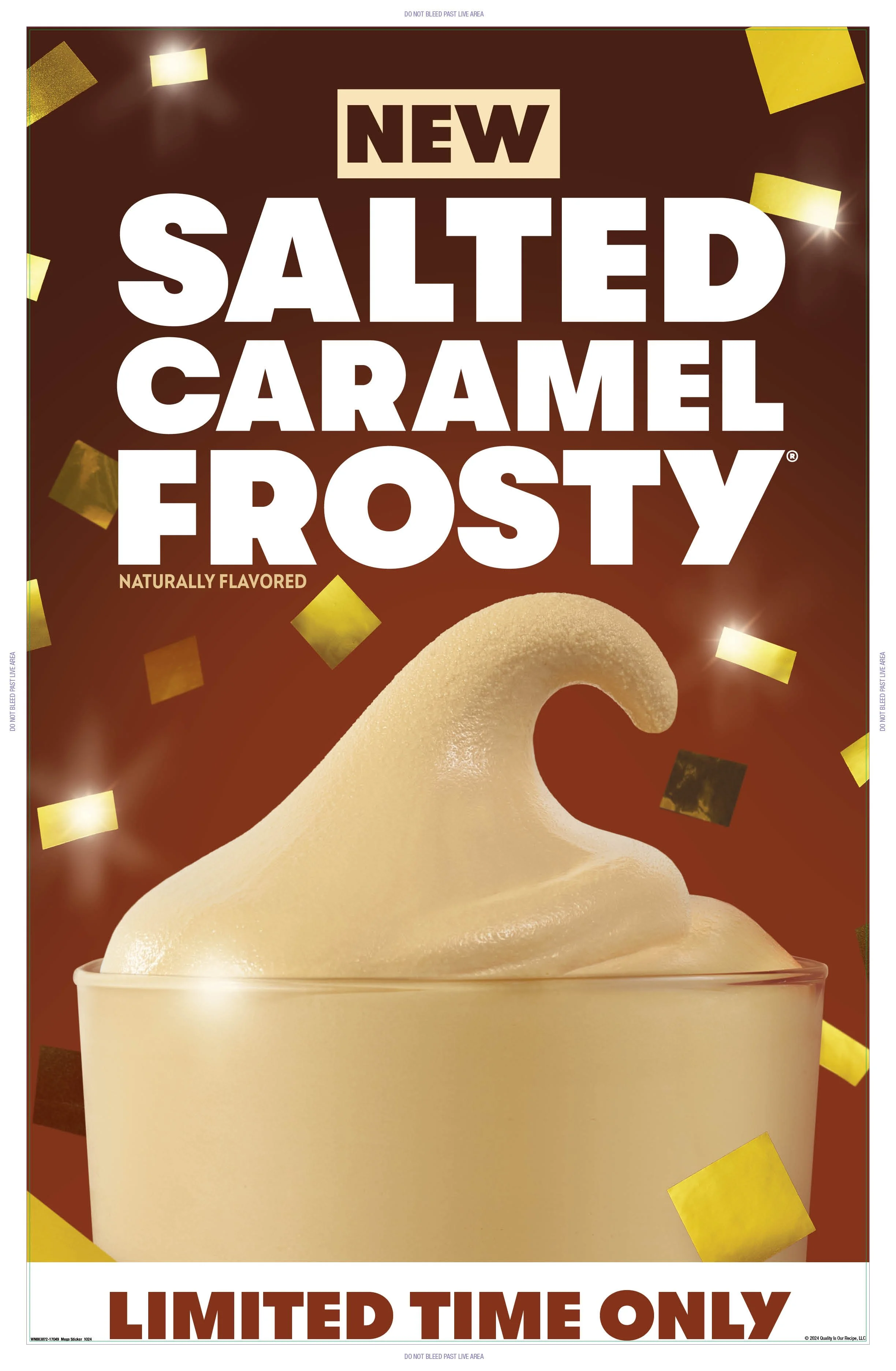
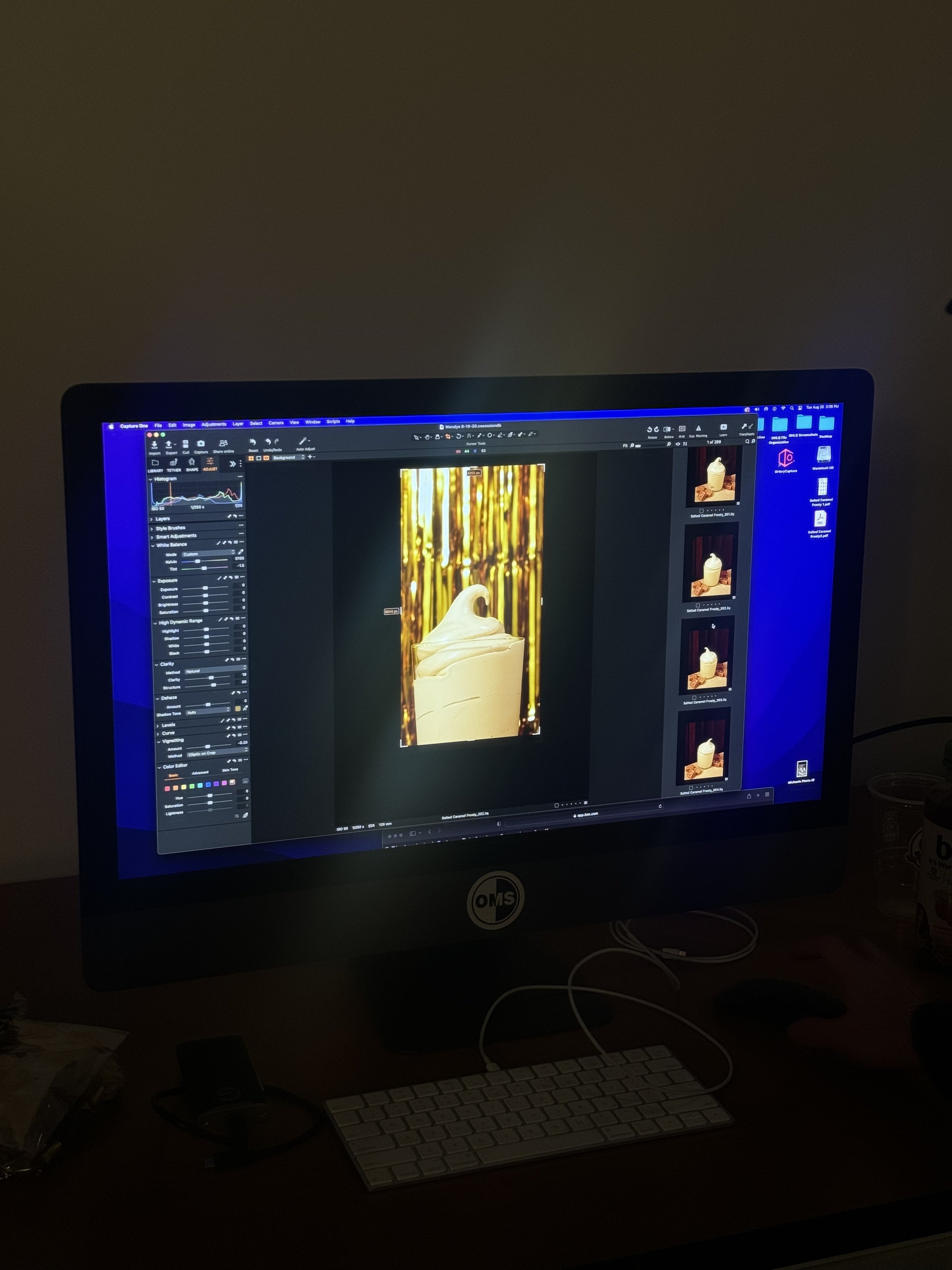
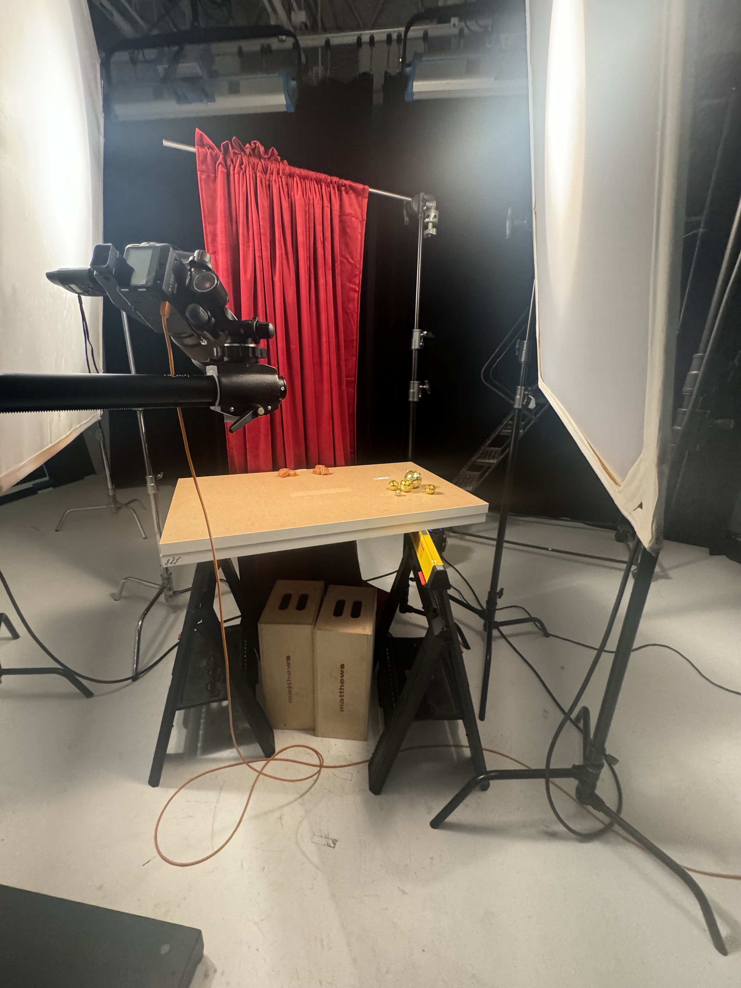
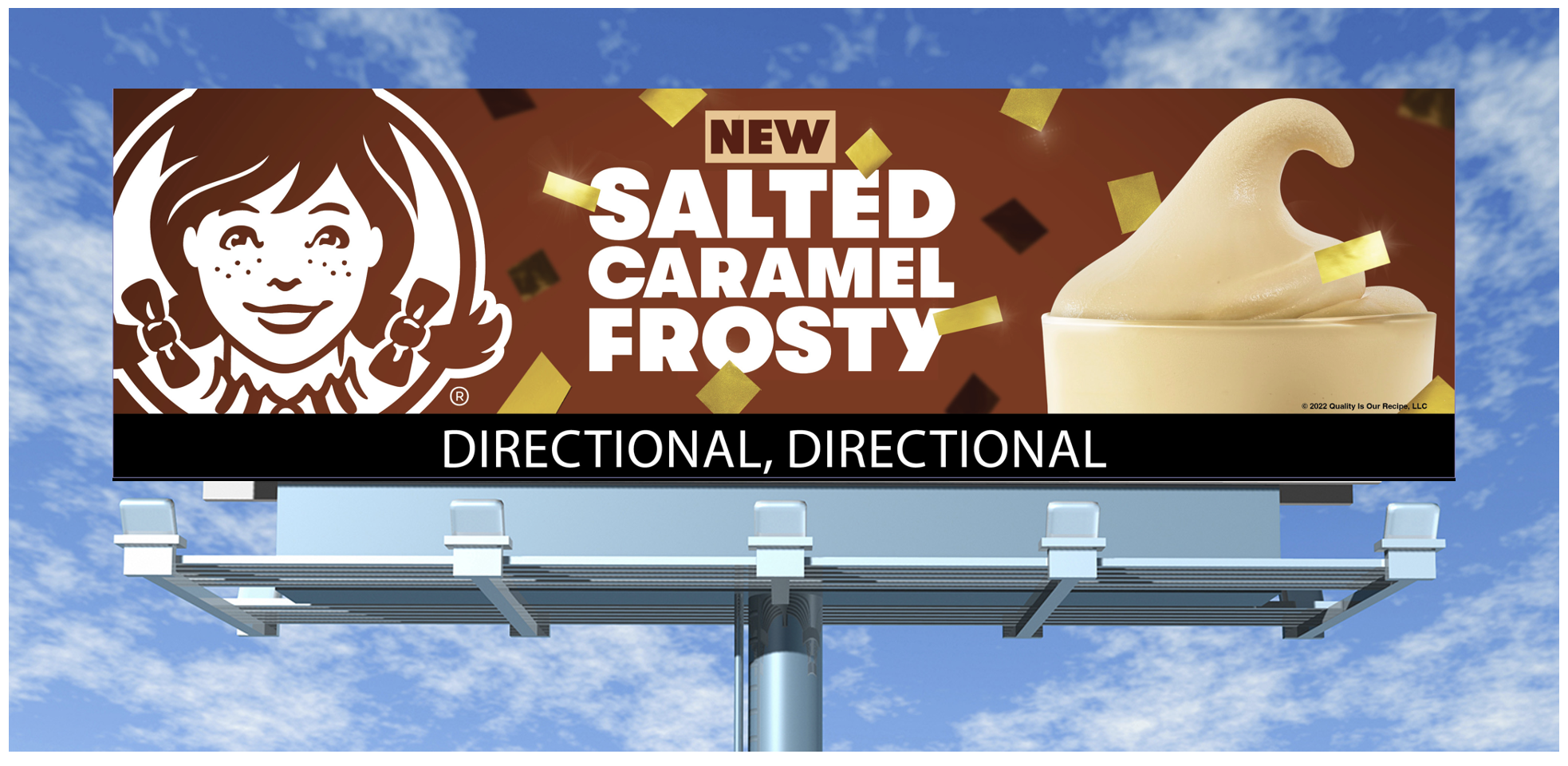
Salted Caramel Frosty
This Frosty came out around the holidays; I wanted the vibe to be celebratory without being too on the nose with a specific holiday while also leaning towards more New Year’s. The gradient background offers a more contrasted backing to our slightly varied “New” box while popping the product name to live in all-white. Gold confetti compliments and pays homage to the color scheme of warm caramel and some subtle light glares and sparkles to set the mood. Overall, the vibe for this drink is warm and celebratory.
The photos provided show the process of the campaign taken from sketch to the photo studio to print and digital.


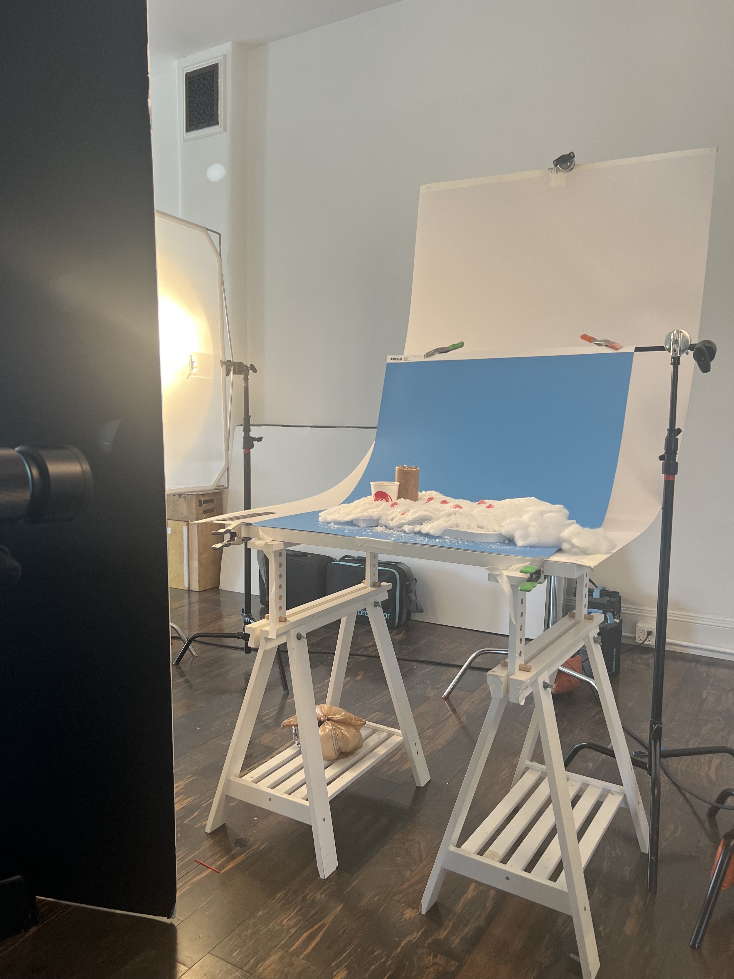
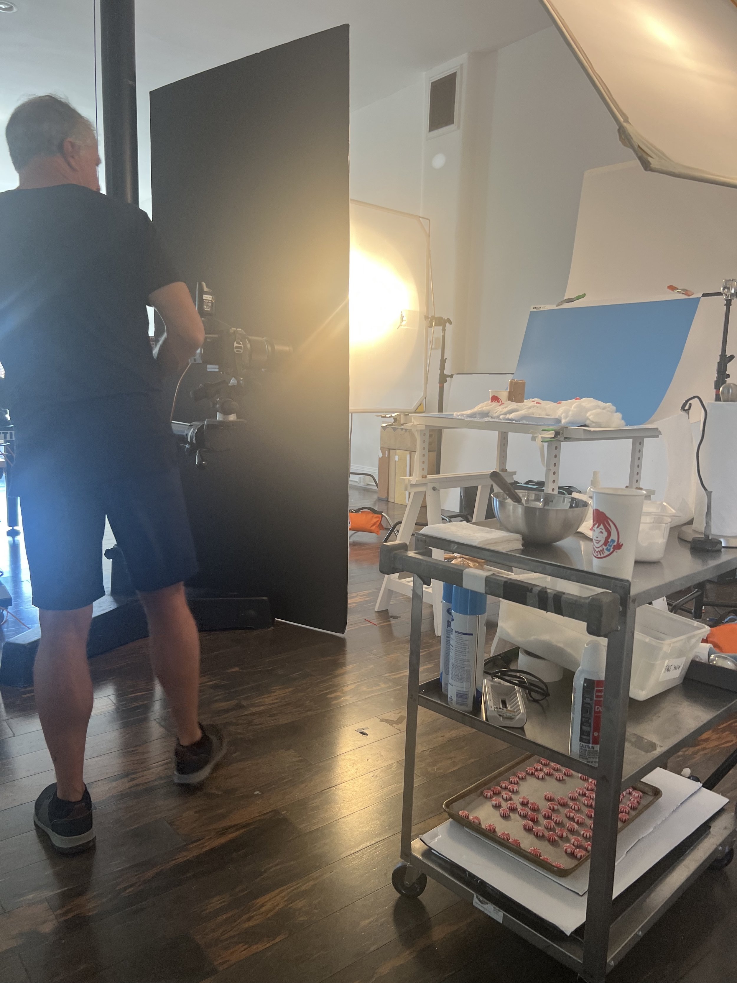
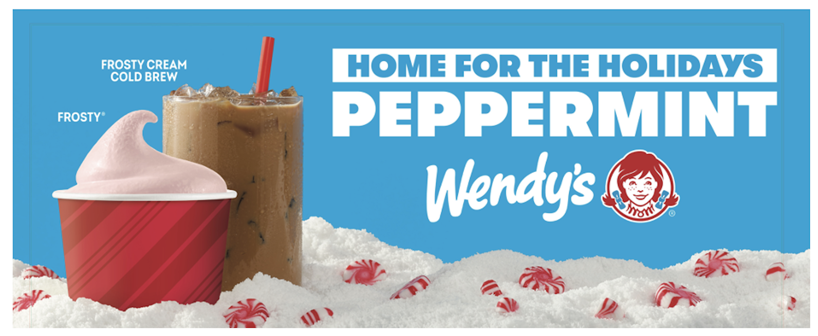
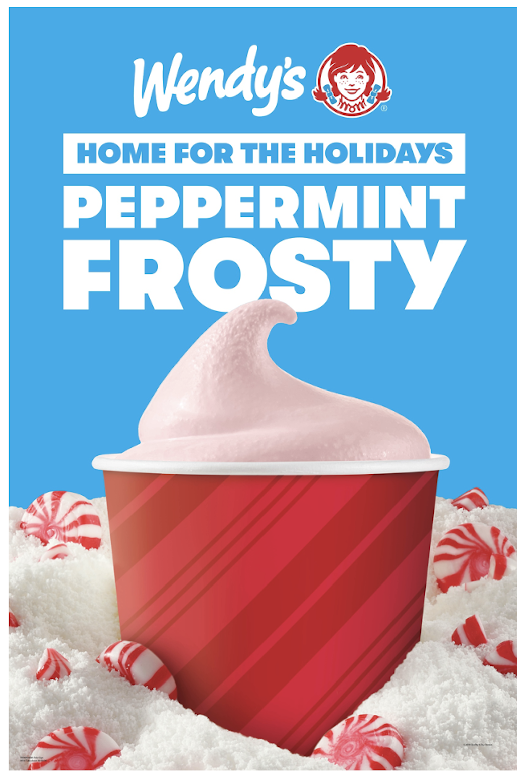
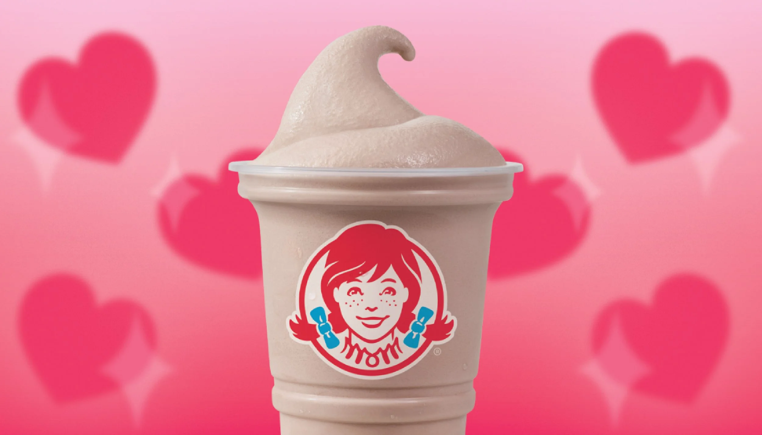
Peppermint Frosty
Refreshing our Peppermint Frosty creative with this being a returning flavor. With this creative, I wanted to lean more into the refreshing side of Peppermint with snow and our blue background with flavor ques of whole peppermints placed strategically. Since the frosty is a light pink color, playing with tonal red for the cup to stick to our brand colors while building up that organic gradient to move your eye to the white typography.
The photos provided show the process of the campaign taken from sketch to the photo studio to print and digital.